Wednesday, 30 November 2016

D&AD Briefing

@DandADNewBlood

D&AD is a non profit organisation that was founded by a group of inspirational art directors including David Bailey, Terence Donovan and Alan Fletcher.

26 Categories for professional awards. Client driven work that has been released in the past 12 months.

Work is judged in London. Judging process is important, integrity is key to everything that goes on at D&AD.

Public exhibition; first D&AD Festival. 25-27 April

Professional awards underpin everything they do at D&AD.

Win One/Teach One basis- Nurture the next generation of talent

New Blood

Celebrate and elevate new creative talent

Awards, Festival, Academy

Academy: Two week workshop. Entering awards and entering for an academy place, or a wild card. Something definitely worth aiming for.

STANDING OUT: Take something that is great and get the word out there. John lewis, amazon, desperados, mubi, squarespace, arjowiggins

Arjowiggins: create a tangible and personal relationship between paper and digital.
Mobil: campaign to get the word out there

SHIFTING PERCEPTIONS: kickstarting dialogue, changing conversations, opening eyes and shaping perspectives

Autistic society
Crowne Plaza

SHAPING THE FUTURE: big chunky challenges

BBc, hasbro, nationwide, pearson

Nationwide:open banking initiative.how can you bring data into everyday life

Hasbro: golden age of board game, but screen crisis. Old school party game

You've got to be in it to win it!

Why is entering so great?

Every single piece of work that is entered is seen by the judges

What does winning look like? key into the door of creative agencies

Ticket to the new blood awards ceremony

Chance to apply to new blood academy

Name in lights

Hamish gardner-cats not ads

WINNING TIPS

1.show personality evoke emotion
2.make a connection
3.be brave 

Make people laugh, cry, gasp, angry; make people care. tell a story and inject some personality. REALLY BE YOURSELF. Level of emotion and humanity that shows through. Should be more than a job to you, its your own life, its your voice so use it. Do the unexpected.

Make a connection between idea and audience. Get under the skin of the people who you are talking to. Look for the white space to generate the idea and deliver an execution from the back of it. 

Go the extra mile and really make a statement. Be bold and be different. Doing things the ways that you want to do them. No matter what you see, that is the number one thing you need to be when you get a brief. Keep going. Originality, bravery and persistence. 

Look at 'stubble' cut the crap

ENTRY DETAILS

Download briefs and create your response
£20 per entry

JUDGING CRITERIA

does it have a great creative idea
well executed
on brief?

How would it be delivered and realised. Real depth of thought for real life. Tell the story and get across the idea of what it is. Show the process and development of idea. Craft based briefs, the execution is key. Craft is always at its most powerful when it is driven by the concept. Keep revisiting the brief. Needs to answer the challenge at the heart of the brief.

PENCILS

Wood, graphite, yellow (bronze silver gold)
White: social responsibility and environmental. combining purpose and profit
Black: Best of the best. New generation of hope.

(no quota on pencils) 

Entry deadline: 15th March (its actually the 22nd)


Tuesday, 29 November 2016

Mega Progress Crit

I only bought along my two building portraits, extended practice sketchbook (sketchbook of confusion) and personal sketchbook with me to the crit, not expecting a great deal to come from it. 


In a nutshell, most of the feedback commented on the fact that I should just focus on things I am enjoying doing, rather than forcing  ideas that don't come naturally to me. I think that the building portraits are the start of something good; I love the whole process, and actually feel confident in the outcome. Sitting in coffee shops, people watching and observing and asking questions in my head about the surrounding environment is something that I guess comes naturally, and also ties in with my interest in sociology and behaviour. 

For the first time in what seems like forever, I've used the sketchbook as a documentary tool for personal outflow for everything that goes on in my head, which actually feels somewhat liberating. Ever since I've studied art, I've seen the sketchbook as a platform for critical judgement. I've been so meticulous about how the pages in my sketchbooks look aesthetically, rather than just embracing it and utilising them for progressive and reflective purposes. 

~I THINK THIS MAY BE THE REVOLUTIONARY MOMENT THAT I HAVE BEEN LONGINGLY AWAITING FOR~

(Here's your mention Jack!) 

Jack gave me a really helpful pep talk about where and how I can build on these ideas and skills and how I can start to regain the confidence in my ability, what a life saver! Having peers that can see the development process you've been through since the start of the course,are able to empathise, give constructive advice and a confidence boost when you need it most really is a god send.
Things that he suggested:

  • Jumping straight to using pen isn't the best way of working (for me) as there is no mercy in using pen and ink straight away.
  • Using pencils more as a preliminary tool is the way to go, this can be adapted, changed, manipulated so that I'm not immediately knocked if something doesn't go to plan.
  • For now, focus on drawing still life things like buildings, food, objects
  • In terms of drawing people,play around some more. Draw different angles of the face. Layer things up on the light box, just go through the process of learning again


Now what? 

I think that due to all of the stress with COP, I'm just going to see extended practice as an enjoyable relief from now to January. I'm not going to let the briefs that I didn't submit put me off, but I'm going to just try my best to make work that I enjoy doing with the hope of it being more successful.

Friday, 25 November 2016

Building of the Week: Smokestack

This week I focused on the Smokestack bar and club on Lower Briggate. I've only been here a couple of times before, but from word of mouth I know that it is a really popular bar in Leeds!

'SMOKESTACK OPENED IN NOVEMBER 2007, AS A PURPOSE BUILT BLACK MUSIC VENUE WITH A STRICT MUSIC POLICY OF BLUES, JAZZ, SOUL, FUNK, LATIN AND REGGAE.'

Minor hiccup...

I'm having trouble finding the history of this building! (In all honesty I just painted it because I was a fan of the aesthetic of it!) Nevertheless, I have to remind myself that I am doing these building portraits because I enjoy them; putting too much emphasis on their purpose at this early stage could be a hinderance to their development.

Perhaps for next time I could formulate a bit more structure to this brief, by looking into how this series of portraits could develop in terms of range/distribution. But for now, I'm just going to have fun exploring illustrative architecture!

Friday, 18 November 2016

Peer Review One

I was really happy that I was put in a group with Georgie and Naomi, as they know how I work really well and are equally as supportive. I was able to explain that I've been struggling with confidence in my visual work and they were able to give constructive suggestions as to how I can amend this as well as build a stronger direction within my practice.

First of all we had to break down the meaning of the learning outcomes, as they are really wordy and don't make much sense when you first read them. Then we each took it in turn to give each other feedback.

6A3: Knowledge and understanding:Research

Contextual references, blog,  primary and secondary research

  • Make sure to do thorough contextual research for different briefs, especially as they are so varied
  • Look at watercolour illustrators
  • Consider the application and variety of outcomes
6B3: Cognitive skills: Problem analysis

Thinking process, experimentation, practical thinking, problem analysis and solution, skills to evidence

  • Be decisive, see briefs through until the end
  • Make sure that I take breaks when I get stressy
  • Research the pathways into where each brief could take me
  • Do more watercolour tests
6C3: Practical and Professional skills: Visual quality

Tone of voice, blogging, presentation, professionalism, mock ups and roughs
  • Get an A6 sketchbook for testing materials
  • Keep it loose!
  • Don't think about presenting until I've finished it
6C4: Practical and Professional skills: Technical competence

Problem solving through concept and ideas, making the brief your own, understanding media and processes
  • Be analytical of WHY things sometimes don't work for me
  • Be honest with myself; what did I enjoy about the process?
  • Don't just jump to one idea, be more open. Diverge and converge
6D3: Key Transferrable skills: Evaluation

Continuous reflection and evaluation of process
  • Good evaluation so far, continue being honest
  • LAYERS: fave way of working
Are the selected briefs balanced and appropriate?

Yes! Focus on the process. Develop strengths and skills.

What time considerations are there?

For the rest of the semester, focus on COP, One-A-Week buildings and possibly the baby clothes brief. Get a move on!

What technical considerations are there?

Watercolour and mixed media, look at the process and how I can apply them. Also look at format and context for the murals.

Self-Evaluation

What do I think works well?

I've realised that my method of layering different media and loose fine line drawings is something that I am good at, and need to do more of because it sort of comes naturally to me. I also really enjoy it! 

How will I capitalise on it?

It is important not to get stuck in a mundane comfort zone. I need to experiment on using different processes with media and refining, such as adding textures and colour digitally as well as manually. Also, not just focusing on buildings; try other things too.

What do I think could be improved?

My stamina with the experimental process when first tackling a brief. Naomi mentioned that I need to 'diverge' with exploration of different options, refine them to a good standard and then 'converge' my preferable idea down to a finished outcome. If it does't work out then at least I have other options, as opposed to completely disregarding the brief all together. That cannot happen when I have a real client to work for!

How will I benefit from it?

I think that I will definitely become more confident in my way of working and my ability to tackle briefs well. I know that I can do it, but need to be less uptight about what the final outcome will look like. This will lead to minimising the amount of 'pigeon holing' that I am currently doing, as well as expanding my practice.

What do I need to revise?

I need to revise why I am choosing each brief. The briefs I have chosen so far are all so varied, which isn't a huge problem, but I definitely need to consider the pathways that I want to take that could lead to potential areas of specialism or opportunities post-graduation.

What will I achieve from this?

I will be able to have a stronger sense of what my work is about and what I want to say. What my tone of voice is and who is my audience. It will just generally make me less of a nervous wreck, and a productive and successful illustrator (I hope!)

What actions will I take from the peer review?

I really need to sort my head out because this amount of stress is doing me no good. Even if it means dragging myself out of bed at seven every morning and doing yoga to wake myself up/calm down then so be it, I can't afford to let my mental health keep getting in the way of my work because it certainly won't get me very far. When I'm in a good place in my head I am able to be productive, enjoy my work and feel positive about it, so more of this please!

Having the discipline to avoid rushing projects is my biggest weakness. Before I start a brief I will leave myself a good amount of time to spend experimenting on a wide scale, then reaching a stage where my finished outcome is something that is refined and that I am happy to submit without any feelings of unease.

It is important that I prioritise my time accordingly to the upcoming deadlines. COP is a huge weight on my shoulders at the minute, and feel like I need to spend every second possible working on it. However I am only just getting somewhere with extended practice after weeks of uncertainty, which I can't allow to slip any further. I have all of the reference material to complete my building per week brief, and they only take a few hours each, therefore I can filter in breaks from COP to complete my one-a-week.

What have I gained from the peer review?

SOME SENSE! I really needed this peer review to nudge me in the right direction and get my feet back on the ground, especially as I've found this week extremely tough and feel as if I haven't made much progress. BUT, I am now aware of what I have to do to get to where I want to be and feel a lot better about my practice than I did at the start of the week. I'm at a stage where I can properly get cracking now and actually make some decent work!


Thursday, 17 November 2016

Building of the Week: Pret A Manger

Hooray, I have finally started this brief! Although I prefer to support independent coffee shops, the upstairs seating area at Pret is such a goldmine spot for people watching and doodling! 

I started with this building because Pret is a large chain of coffee shops that has a bit of a reputation for being really middle class. The company was founded in 1983 by Jeffery Hyman, with the first store opening in Hampstead, London. The name comes from the French, 'prêt-à-porter' meaning ready to wear, or in this instance, 'ready to eat'. This higher quality ~fast food~ reflects on the fast paced society that we live in, as well as brand association/reputation.

(ref:https://en.wikipedia.org/wiki/Pret_a_Manger)


History of the building

I found out that the building used to be a mattress and bedding manufacturer! The family-run shop was based here in Lands Lane, and the factory/offices were situated in New York Street.


(ref:http://secretleeds.com/viewtopic.php?t=4780, leodis.net)

Reflection

I've been really interested to find out how these beautiful original buildings have evolved to fit in with mainstream culture and consumerism. Its a shame that our society does't always appreciate the history of urban environments and celebrate originality. Perhaps next week I should focus on more of an independent business? 


Friday, 11 November 2016

Observing Leeds

Yesterday I rented a camera from college and went on a six mile round trip of Leeds, simultaneously straining my neck from looking up to discover how beautiful the buildings are here. This idea was suggested by Matt in my tutorial last week because I really love drawing buildings, and was urged to do more of it. I finally got round to actually getting out and spending the day observing.

It was so refreshing just to walk around by myself and really absorb the architectural details of the city; I took particular interest in comparing the old with the new, kind of like a comparative juxtaposition. Additionally, I love people watching. There are SO many characters within Leeds ranging from the vast array of students, local residents and visitors from afar. In parts of my day, I took coffee breaks and made some little sketches of the people and places that surrounded me.

Sketchbook Pages


Selection of Photos


Ideas for Development:

  • One a week interesting building in Leeds. E.g. 'building of the week': could develop these into postcards/prints
  • Concertina book?
  • Project exploring the changing face of Leeds, growth and development?

Thursday, 10 November 2016

InDesign for Publications

~Just a few reminder notes about how to use InDesign~

Always go to file-new, new document

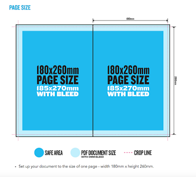
Much more likely to enter a custom page size with width and height.

Always work at actual size. Never expect to enlarge or shrink the document.

Columns and margins are very useful; allow us to put guides on each page of document that will assist us putting the content on the page.

Gutter is the space between the columns.

Margins; specify a border around the inside of each page. E.g. if you're working with a lot of text or a newspaper layout. Framing content in white space enhances readability. Don't have to use them on every page.

Bleed- full bleed is without a margin. Compensates for any inaccuracies in the trimming of our print. Trimming is always a part of the production process, particularly when making books.
Standard bleed amount is 3mm.

Slug- Another area that you can set which sits outside of the page. Not as common as bleed. Generally about 2cm. Allows us to include printers parks i.e. crop marks, trim marks etc that aren't part of the layout. Gate fold can be used with slug.

Trim marks/fold marks can be added when sent through to print.


Thinking about printing

Printing A4? Must print on oversize A3 (SRA3) or A2 to include crop marks and full bleed at actual size.


Choosing a size smaller than A4? Can print on A3 with crop marks, on any printer in College.

Number of pages is determined by the content. How the book is going to be bound has a consequence on the number of pages.
Most popular binding method is saddle stitch. Has to be a multiple of 4.

Facing pages: If you're making a book, tick this box.

Readers Spread: How the book will be once it is printed, bound and you are reading it.

Printers Spread: Pages are re-ordered to print in the correct order. Indesign will do this for us but it is useful for us to calculate and know how these work. They will always add up to one number higher than the number of pages.

Printing to a laser printer:

File-Print Booklet

Booklet Type: 2-up Saddle Stitch

Print

2-up Perfect Bound: Single sheets of paper, which allows the book to open flat. This is also useful when using heavier stock.

Creep Value: (heavier stock) Make a mock up of each section on the stock you will use and measure how much the middle pages stick out, e.g. 5mm, put -5 in the creep box. Amazing!
More apparent on the centre spread of the document.

Full bleed? Creep isn't an issue. Creep is only an issue really when using margins as it becomes more apprarent.


Photoshop image preparation

1. 300ppi
2. Actual size
3. CMYK or greyscale
4. Save as .tif or .psd, NOT .JPG

Get image onto page: File-Place

Creating frame in advance: Make empty frames on the pages.
Rectangle frame tool

Object-Fitting-Fill Frame/Content Proportionally (makes the image fit the frame)

When we change the size of the image in InDesign, it changes the resolution.


I


nformation about image size? - Links palette
Need effective PPI to be 300
Scale Percentage: How much the resolution has changed in InDesign


File-Package: Makes sure that all of the images are in the same folder as the document.


Context

If we were using an external printer. www.newspaperclub.com


Includes a specification to follow, OR an InDesign template


Tuesday, 8 November 2016

Thinking About Buildings

I've been thinking a lot about my tutorial with Matt last week and the issues that we discussed regarding developing my practice. One of the most important areas for improvement that we spoke about was my inability to complete briefs, due to a lack of resilience and confidence within my work. Additionally, I don't draw enough of what I enjoy! 

Recently, I've really enjoyed drawing buildings in my spare time so it came to light that I should focus my attention to this, and set a brief for myself to explore illustrative architecture further.

Selection of Sketchbook Pages


Contextual References

James Gulliver Hancock


I discovered this book at the barbican gallery shop in London and couldn't put it down! The colour schemes and quality of line are BEAUTIFUL, and each illustration is accompanied by the history of that building. Also, I really admire how Hancock has used architecture to document his travels/discoveries. His work has a really organic tone of voice that can be appreciated by audiences of all ages.

Lucinda Rogers


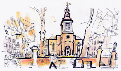
I've been an advocate for Lucinda Rogers since we studied her in first year, particularly taking a liking to her variety in line weight and use of mixed media. There is so much energy and emotion in the aesthetic of each scene that Rogers illustrates; the audience can gain a lot of information from one drawing which is really powerful.

Accidental Vix

This image of Kirkgate market was produced by illustrator and maker 'Accidental Vix'; I first came across her work in the Great Yorkshire Shop in the Corn Exchange, as well as the Leeds Etsy sellers fair at Christmas. The series is called 'as scene by me' and focuses on the aesthetic of Yorkshire architecture.

What now?

I still need to go around and take photographs of Leeds, which I aim to do this Friday if the weather is good! As well, I think it would be a good idea to do some additional contextual research on the history of Leeds as a city to give me a bit more structure on where I could go with this potential project.


Thursday, 3 November 2016

Health Editorial of the Week

Since yesterdays tutorial with Matt, I have decided not to continue with this brief because like we said, it isn't really me, and won't support and help to develop my practice as much as I'd initially anticipated. So here is what I did and where I went wrong.

The article: https://www.theguardian.com/society/2016/oct/12/more-babies-face-health-risks-due-to-obese-parents-experts-warn


Roughs/Development:


Final Outcome:


Evaluation:

  • Extremely literal; going TOO far out of my comfort zone will not help me develop my practice
  • Do more of what comes naturally to me
  • Stop doing work that I think I HAVE to do

Wednesday, 2 November 2016

Tutorial With Matt

Todays tutorial with Matt was a huge reality check for me. In a nutshell he made me realise that I am making work that I think that I need to do, rather than work that I am interested in and passionate about. 

Areas we discussed and advice given:

  • Health editorial ONE A WEEK project that I have started on; a little underwhelming. Doesn't show my ability to work well within layers and different qualities of line. Maybe put this project to rest. Editorial is extremely specific and condensed and maybe a bit restrictive in terms of the way that I work.
  • The production process of my line drawings is one of my strongest areas. This showed in my cardigans and building portraits.
  • Why aren't I fully resolving briefs? "Its like you're a chef and boiling eggs but not making a meal".
  • I need to make work that I can take ownership of and that I believe in, and need to find the confidence and perseverance to do this.
  • What is interesting to me? What do I care about?
  • Opportunities will arise if I am determined and actively look for them
  • We discussed my COP project. How does illustration relate to that?
  • COLLABORATIVE children's book. Is this something that I am really passionate about?
  • Find what feels good
  • In terms of PORTFOLIO: FMP needs to be one big thing that represents me and what I am interested in. FINISHED IMAGES resolved from a range of briefs.
  • With being an illustrator, you never really reach an ultimate end-goal. It's a life long, continuous practice.
  • ENJOY IT
I've realised that all I have been doing is worrying about what I am going to be and should be doing 'ultimately' within my illustrative practice. My worries and lack of confidence in my ability have been crushing me ever since I have been on this course because I have this idea in my head that I need to come out of college with so many labels of merit that could get me a job. SO I NEED TO STOP WORRYING AND START DOING WHAT I LOVE DOING AND AM GOOD AT!!!!!

Plan of Action:
  • Get a camera, go around Leeds and take loads of photos of interesting buildings
  • Instead of health editorial a week, do a building a week
  • Draw more from observation and for pleasure
  • Don't be afraid of working large scale
  • STOP LEAVING DRAWINGS AND BRIEFS UNRESOLVED
  • Stop worrying...(if only)