Thursday, 28 January 2016

Illustration Friday: Orbit

Initial Ideas

  • Chewing gum
  • Solar System
  • Moon
  • Dizziness (birds flying around head)
  • Planets
  • Maypole dancing
  • Hula hooping
  • Casino wheel
  • Kaleidoscope 
  • Compass
  • Synchronised swimmers
  • Dancers
  • Clocks
Thumbnails

The first thing that springs to everyone's mind when they hear the word 'orbit' is anything to do with outer space and planets. I was really determined not to take a literal approach to this topic, so I explored many options. I initially thought of other things that travel in circles, for example kaleidoscopes and compasses, but I wanted it to be more exciting than just an object. I tried out a few thumbnails of May-pole dancing, but I found out that this didn't really have the impact that I was aiming for. I then thought of synchronised swimmers, and really enjoyed drawing figurative shapes interlocking with each other, so I took this idea forward.

Reference Imagery

Swimming pools and anything to do with water is particularly difficult to put down onto paper. I had a look at some photographs of wave and light refraction on the internet and had a go at tracing some of the shapes that were created by the movement of the water. It also helped to look at other illustrators who had produced work on this theme, for example Virginie Morgand, who had produced a beautiful three colour screen of swimmers, focusing on the body as a contact in water and on the surface by overlaying colours.

Process

I decided to work in vectors this week for a change as I didn't want my skills to become too rusty. I found the water extremely challenging to draw, as I wanted it to look realistic yet simple at the same time. The process of using vectors is pretty straight forward, but I hope to broaden my skills further by discovering different textures and effects, to move my work on from a simple series of flat shapes.

Evaluation


I'm pleased that I came up with a concept that wasn't extremely generic in response to the word orbit. However I am feeling a lot of pressure with deadlines from my other modules this week, and I feel the stress of those has impacted on my work a little. The water was so challenging to portray, so I think I definitely need to work on this. Also, I'm not entirely sure that the swimmers are 100% clear either, and I'm slightly worried that it looks like something from 'The Human Centipede'... Nevertheless, I seek to improve on my methods of illustrating water, and continue working on the strength of my concepts.

Wednesday, 27 January 2016

Design Bridge: Week One


In the past week we have all individually been researching into gender stereotyping in the cosmetic industry to generate some initial ideas for our project.

Research: Products and Packaging

I went to have a look at what Boots had on their shelves, being the number one retailer for cosmetics in the UK they were bound to have a large variety. I set myself the task of finding very stereotypical mens/womens packaging, and packaging that was inviting for any gender to use.


Men's Products
 In the words of the brief, a lot of the products aimed at men 'looked like power tools'. The majority of their visual aesthetic is simple (not too much intricate detail) bold in design/typeface and using a selective colour palette, e.g. orange, blue, white, grey, green, silver. NOTHING PINK. From a pragmatic perspective of a customer, they might take the 'deodorant is deodorant' approach, meaning that they are not affected by the appearance of the product, but solely buy it for its purpose. But this is only a small majority, as the majority of women are driven by brand association, and will not be inclined to buy a product that does not represent their identity on paper.


Women's Products
There was a higher quantity of women's products on the shelves at Boots, simply because a large percentage of women pay more due care and attention to their physical appearance with products such as makeup etc. Most of the brands targeted at women included colour palettes that were bright and flamboyant, with a larger use of pattern and intricate packaging designs. The brand that stood out to me the most to be the epitome of femininity was Soap and Glory. With the pink/creme/lime green colour scheme and the sickeningly sweet fragrances, no product shouts WOMEN more than this. And to emphasise the point even more, their promotional strategy includes imagery of extremely glamorous women in a 'vintage' style, which is a current fashionable trend. Soap and Glory also pushes the boundaries by using euphemisms/playing on words to make their products come across as a little 'risky' and cheeky, which makes an automatic connection with all women.
Gender Neutral Products

This array of products didn't shout either MEN or WOMEN directly at me from a visual perspective. Without offensive/in-your-face stereotypical colours, these products immediately give the impression that their target market is not gender-specific. A good example of this is the Garnier brand designed to help improve the quality of skin. Common skin conditions such as oily skin, acne etc. affect people of all genders and races, and can occur at any age, especially in teenagers and people in their twenties. The customer would buy this product based on its purpose; to improve the condition of their skin, and would choose the product that will best serve that purpose. The importance of looking after skin is quite significant, and can have an impact on people's confidence and self esteem, therefore from a wider perspective is not considered as a luxurious product. 

Reading

I went to the library and took out these two books to help broaden my knowledge of gender and sexualisation.


Media, Gender and Identity- David Gauntlett

Why media influences are important:

  • Media influences are important because on average, Americans and Europeans watch around 3-4 hours of television/spend on social media per day-which means lots of information is going into their heads
  • Media shows us situations and relationships from other peoples points of view; 'how the world works in lives other than our own', which affects our own way of conducting ourselves 
  • This can be in domestic/romantic drama, magazines aimed at women, movie heroes (male or female) and images of 'attractive people' 
Sexual identities today:
  • Although the LGBTQ group continues to face prejudice and discrimination, Western societies, especially the younger generation are becoming more accepting of sexual diversity
  • The legal status of gay and lesbian partnerships has become more accepted in some parts of the world, and was legalised in the UK in 2014
  • Identities are complex constructions, and gender is only one part of an individual's sense of self. Ethnicity, class, age, cultural background etc are also important factors
Gender in contemporary advertising:
  • In advertising today, the representation of women and men isn't usually obviously sexist
  • If advertising is unapologetically sexist, it is presumably used because the message 'works' for the target audience, despite potentially surprising and offending others
  • Advertisers have realised that it is not good business to offend their customers with sexist stereotypes
Selling beauty:
  • There are more women in advertising than there are in TV programmes
  • Make-up adverts remind us of concerns that are uniquely applicable to advertising-that is produced by capitalists who want to cultivate insecurities which they can sell 'solutions' to
  • "Every woman knows that, regardless of her other achievements, she is a failure if she is not beautiful... The UK beauty industry takes £8.9 billion a year out of women's pockets. Magazines financed by the beauty industry teach little girls that they need make-up and train them to use it, so establishing their lifelong reliance on beauty products"
  • The beauty ideal is often a substantial pressure on women, but it doesn't just affect women 
Summary:
  • Representations of gender today are more complex, and less stereotyped than in the past
  • Women and men are generally equals in the worlds of today's TV and movies, although male characters are still often to the fore
  • Women are seen as self-reliant heroes quite often today, whilst the depiction of masculinity has become less straight forwarded more troubled
  • Advertising in the broader world of stars and celebrities, promotes images of well-toed and conventionally attractive women and men which may bean that everyone is under pressure to look good, although women are additionally coerced about makeup and subjected to even greater paranoia about looking thin
  • Meanwhile gay and lesbian characters have started to gain a certain amount of acceptance within the TV mainstream, but remain relatively uncommon in movies
  • The modern media has a more complex view of gender and sexuality than ever before
  • Images of women and men which it propagates today may be equally valued, but remain different and diverse
Sex and Gender- John Archer, Barbara Lloyd
Commonsense beliefs:
  • Everyone has ideas about the nature of men and women and knows in a common-sense way what they are like
  • Beliefs handed down through the generations provided a way of understanding first-hand experience so that the nature of men and women, and their place in wider society, became matters that were taken for granted
  • Today, those of us who live in liberal Western nations have become used to traditional traditional beliefs about the notes of men and women being contested
  • No longer is there an unquestioned consensus about what is the natural order regarding women and men
Stereotypes, attitudes and personal attributes:
  • Stereotypes are the shared beliefs that people hold about a particular group of people e.g. ethnic group
  • In everyday conversations, people make all sorts of generalisations about men and women, e.g. 'all men are the same', 'all women do is talk'
  • Stereotypes minimise individual differences. In the examples given above, the characteristics are not exactly desirable, and can therefore form the basis of prejudice and discrimination against the group concerned
  • "Gender roles and stereotypes held in a society at any one point in time are rooted, not primarily in the society's cultural tradition, but more importantly in society's contemporaneous division of labour between the sexes. Women are viewed as suited for the specific and social roles that women typically occupy, and the same applies to men" (Eagly, 1987:21-2)
  • This view of gender stereotypic traits is known as the social role theory,because it links the traits to the societal roles of men and women. It predicts that if the roles change, then the stereotypes will also change
  • There is no evidence that gender-stereotypical traits have changed during the time when women's occupational roles have changed
  • Most of the existing research on gender stereotypes, and in individual differences, has focused on personality traits. However, both gender stereotypes and gender-related personal attributes involve other components such as behaviour, occupations and physical behaviour
  • Deaux and Lewis (1984) suggested that people link the different components of gender stereotypes together in their minds. E.g. if someone likes cooking, we may think that they will also like sewing (both feminine activities)
Summary:
  • Stereotypical traits associated with men and women follow from their traditional roles, and could be manipulated by qualifying the general category 'man' or 'woman' to indicate a different role
  • One influential view of stereotypes is that they are derived from simplified versions of reality
  • An alternative view would be that stereotypes provide rationalisms for the roles in which people are placed, irrespective of their real individual characteristics


Group Meeting

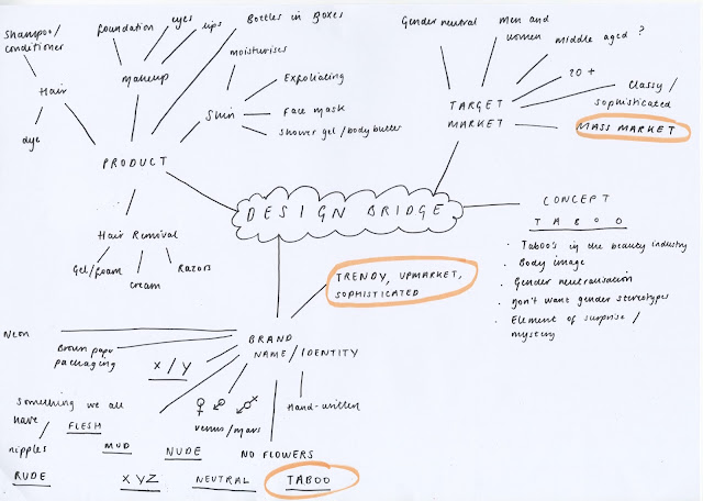
We have agreed to try and meet weekly as a group, and set tasks to complete in between. In todays first meeting, we brainstormed our ideas to try and establish what we want to produce and communicate.


We thought of many gender neutral names, but thought 'taboo' was the most suited as it represented the stigma attached to the LBGTQ community. We aim to eradicate this stigma in a trendy yet upmarket and sophisticated way.

We also tried to think of ways that we can make the packaging more exciting, for example adding an element of surprise of unexpectedness.

Between now and the next time we meet, we have agreed to come up with some rough designs and any general concepts and imagery for the product and explore potential options individually in more detail, so that we can share ideas together. 

We have also agreed to research in

Productivity Plan:

  • Record any initial thoughts and ideas in sketchbook
  • Research in depth one cosmetic brand e.g. the body shop
  • Do lots of thinking and experimenting!

Saturday, 23 January 2016

How To Be a Woman: Initial Research

Brief Deconstruction

What do we have to do?

Design a new, classic cover for Caitlin Moran's book, How to Be a Woman. 
Who is the audience?

Predominantly females, feminists around the ages of late teens- fifties/sixties

Deliverables?

1 x cover copy as supplied and be designed to the specified design template (B format, 198mm high x 126mm wide, spine width 20mm).

What does it need to stand for?

The design needs to feel timeless and classic, whilst at the same time making it clear to the reader that it is very entertaining and often very funny. The book should feel very accessible, immediately ‘pickup able’ and something that exists within the world of Popular Culture.

Research

Initial Findings

This is the first 'feminist' book I have read, and it was honest, witty and surprisingly full of a lot of good morals. In each chapter, Caitlin Moran elaborately comments on different aspects of womanhood from a personal, general and external perspective with the overall intention of understanding the way that women work (which can be largely complex).

The existing cover of the book features a portrait of Moran herself, a striking, gutsy and bold representative of all things female. I can already gauge that it will be challenging to make an alternative version of this cover as the image of Moran is extremely powerful. This may sound silly but it is difficult to think outside of the box when the initial and original cover is a portrait of the author themselves, standing mighty and proud at the front of their hundreds and thousands of words, how do you top that? Really? Just the concept though. The typeface and colour is pretty shoddy to be honest.

This seems to be a constant theme with Moran's books, she is the brand, this powerful feminist figure. So I had a look at the existing market for feminine/feminist books for inspiration and of course the majority feminine book covers were pink, flowery and cutesy. However the femiNIST books I came across were edgy, blunt and very 'to the point', which is similar to Moran's style of writing. Some of these examples contained imagery that others may find offensive/alarming/inappropriate etc, which is one of the best ways to grab the readers attention (in other words make them do a double take because they think they have seen a nipple). 

Initial Thoughts

I started with my generic 'start-of-brief-mindmap' where I brainstormed everything to do with us women, followed by picking out some of the most memorable quotes from the book and making a few sketches from them. My ideas so far include:

  • Imagery relating specifically to women, what defines us? 
  • Emphasising the HOW TO part, maybe doing something like an instruction leaflet?
  • A womanly survival kit?
  • Playing on stereotypes like being pre-menstrual, going through puberty/pregnancy etc
  • A paper doll of a woman?


Plan of Action

My mind is all over the place thinking of how I can effectively tackle this brief (as well as the mountain of others we have to do right now). I may have to put this brief on the back burner for a while whilst I get other upcoming deadlines out of the way, but in the mean time I will try to jot ideas down as soon as they come to me and keep looking and researching feminist illustration and book covers.

Thursday, 21 January 2016

Illustration Friday: Spin

Initial Ideas:

  • Spinning wheel
  • Spinning top
  • Spin class
  • Bicycles
  • Washing machines
  • Dancing
  • Record player
  • Board games
  • Spinning a web

Thumbnails

From my initial ideas, I developed the spinning top, spinning wheels, spinning a web and washing machine concepts. I really enjoyed drawing the spiders and was prepared to take an illustration of a spider spinning its web forward for a final piece, yet I thought in hindsight maybe it was a bit obvious and that I should push myself more and come up with something more imaginative. For some bizarre reason, the image of a hamster running in the drum of a washing machine popped into my head, which then lead on to the development of the hamster going snorkelling in the washing machine... I thought it was more interesting than a dangling spider so I went with it!

I found it really difficult to make the hamster look like it was swimming, especially positioning the flippers at the correct angles. I gained some advice from my illustrator housemates (previous owners of rodents) that animals walk with opposition to their front and back set of legs. After a few sketches I found that this looked a lot more like the hamster was paddling in the water rather than doing a superman pose.

Composition wise, I gathered that it would look more aesthetically and compositionally pleasing if I were to present the contents of the image within a square as opposed to A4. Taking into consideration future illustration Friday's, aiming to complete 10 in total, I will produce five square and five A4 images, which will make it easier when coming to present as well as helping me adjust to different canvas sizes.

Reference Imagery

The images that I used for reference really helped me to achieve the action of the hamster swimming in the water, as well as the anatomy of hamster itself. It was challenging to draw the flippers onto the hamster as I had to make this up due to there being a significant lack of images of hamsters wearing flippers on the internet... To overcome this, I looked at a few more images of humans diving to study the position and movement of the flippers, and applied this in the correct way to the hamsters feet.

Process

Again, I used photoshop brushes to create the image, and I can see myself making improvements each week which I am really pleased about. I built up layers of the hamster to ensure that its fur looked textured and fluffy with different patches of colour, and I did the same for the water using different shades of blue and varying opacities. In hindsight, I did rush the image a little bit because my laptop was running out of power (what a poor excuse) so the washing machine looks a little more sketchy than I'd hoped, but its not too bad, and gives a more contemporary feel with an added sense of movement.

Evaluation


Admittedly I don't think this is my best piece of work ever, but I'm glad that I am pushing the boat out more in terms of concepts, as my work in the past has been fairly literal and cliche at times. I'm so pleased with the way my hamster turned out and looked so effective with the brushes I used. I'd like to develop on this further, and potentially look at downloading or making some custom brushes. 

Friday, 15 January 2016

Design Bridge: Breaking down the brief


What is the problem?
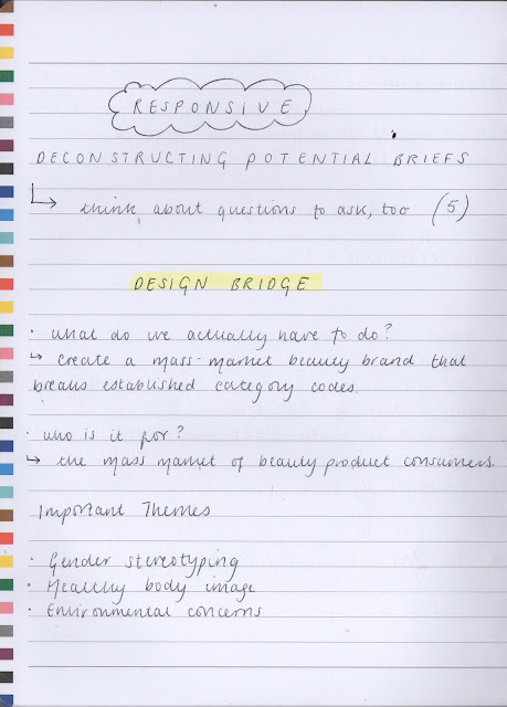
We are required to create a mass market beauty brand that breaks established category codes. The brand should respond to the issues in todays society that the cosmetics industry has failed to keep up with, for example gender stereotypes, healthy body image, environmental concerns etc.

How do we aim to solve it?
We will combine our skills and ideas to come up with an ethical and respectable brand that will appeal to a large target audience, simultaneously respecting customers with alternative gender types to avoid exclusion. Our values will reflect in the aesthetic of our branding as well as the materials and processes that we use in the production of the product, and the methods of promotion and distribution.

What will we be aiming to communicate?

Through our various methods of communication we aim to celebrate the diversity of society on a number of different levels. We aim to educate and inspire other large cosmetics companies that the promotion and branding of cosmetics should emphasise being inclusive  as opposed to singularly targeting exclusive groups. As the vast majority of people in this country are consumers to the cosmetics industry, everyone should be valued and respected with the same level consistency. 

Who is our audience?

Our audience falls under the 'mass market' category, which will be available to purchase in large cosmetic chains for example Boots and Superdrug, therefore it will be exposed to the largest range of consumers, rather than specific groups e.g. bargain stores or more affluent and independent higher end stores.

Thursday, 14 January 2016

Illustration Friday: Tropical

Initial Ideas:

  • Tropical Fish
  • Tropical Birds
  • Hot countries
  • Refreshing drinks
  • Foliage
  • Rainforest
  • Jungle
  • Cocktails
  • Fruit
Reference Imagery

With tropical being such a broad and exciting theme, I explored a number of different options before settling down on one aspect in particular. It was useful to re-discover all of the striking and vibrant colours of tropical elements, and working from secondary photographs helped me to gain an insight into the differences in culture too.

Thumbnails

Initially I wanted to challenge myself by illustrating an underwater scene with an array of beautiful sea creatures. After trying out some rough sketches, I realised that this wasn't really going anywhere, and re-evaluating the theme and gaining some peer feedback, I decided that it was probably a bit of a cliche area to choose. I really enjoyed drawing tropical birds such as parrots and toucans but then again, there were a lot of them that people have already submitted to illustration Friday.

To overcome my indecisiveness in choosing a section of 'tropical' to work in, I researched for tropical animals and began drawing different species of frogs, which I really enjoyed. I quickly decided that I would create an illustration involving a tropical frog.

Process

From last weeks jaffa cake success, I chose to work in photoshop again this week, trying to further build my skills in using the different brushes. As opposed to last week, I paid more attention to gradually building up the layers of the piece by applying basic block colour, and step by step adding the lighter and darker tones with the textures brushes. I did come across a few difficulties because I accidentally lost the brush that I was working with, without realising that I'd switched to pencil mode instead of brush mode, but subsequently this resulted in me discovering some really interesting textures that I used for tree bark!

I think that once I become quite familiar with the whole process of painting with photoshop, I will work more time efficiently, which will benefit me being able to work at a quick pace and produce a larger quantity of work.

Evaluation


As promised, this week I have stepped up from a simple vignette-yay! Already I can see an improvement in my brush skills to where I have applied lighter and darker shades to create a more three-dimensional effect. However, I do feel as if I should have spent a little more time considering the background; I feel like the gradient is a little bit of a cop out to be honest, but I didn't want to over-complicate the image and divert away from the main subject matter.
Overall, my illustration is a substantial reflection of the tropical theme, showing a sense of narrative and well thought out composition. 
My aim for next week, as always is to improve; it might be useful to watch a few tutorials on youtube to do with photoshop and gather some more techniques, as well as looking at a wider range of brushes I can potentially use.

Collaboration

For the second part of responsive we have to collaborate with other illustrators/graphic designers/animators...I'm really excited but nervous at the same time!

Researching Briefs

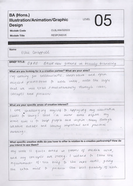
It is mandatory that we choose either a YCN/D&AD brief to collaborate on. I was eager to push myself and try something that I would normally choose as a 'comfort' option, as I want to broaden my skills as a practitioner. I narrowed my choices down to three briefs:

  • YCN: A2 Milk
  • D&AD: John Lewis
  • D&AD: Design Bridge
Deconstructing the briefs


Final Decision Making


It was a difficult choice between Design Bridge and John Lewis, as they both offered opportunities that I was interested in engaging in. On a moral basis, I chose Design Bridge, as it is for a more worthy and current cause to do with gender stereotyping through the cosmetic industry. I am really eager to learn more about gender identity, and am keen for my work to help eradicate the stigmas associated with it.

Deliverables

The main deliverables of the Design Bridge Brief are:
  • Create a mass-market beauty brand that breaks established category codes
  • The brand should respond to issues in modern day society; e.g. gender-stereotypes, healthy body image and environmental concerns
  • Find a name which reflects the brands values
  • Design packaging that embodies the brand and show how it could work across a range of at least three products
  • Eight presentation slide images
COLLAB-TINDER

We were required to make a presentation displaying for images of our strongest work, work that we admire and our contact details, for other participants to consider when we have to choose who to work with.

The images I have chosen show that I am able to work confidently in both digital and analogue processes. On the second slide, I chose practitioners work that I admired relating to the product packaging and window designs (when I was unsure whether or not to do the John Lewis brief). 


Eventually a little group of ours came together, despite all of the worrying! I will be working with Amber (illustrator) Rowan and Tom (graphic designers), who are all really friendly and easy to get along with. I'm really excited to be working with them! We filled in  our code of conduct, created a Facebook group and agreed to meet in two weeks time with a few initial ideas and background research.


Emil and the Detectives: Further research and thumbnails

The first slide of images contains research I carried out before Christmas; the very first aspects of the story that I discovered, and elements that I touched on. I have come to realise that I probably didn't do this in the correct order, as I didn't properly deconstruct the brief and pay attention to the requirements of the brief, however I carried that out today.

Brief Deconstruction

What do we have to do?

Design a whole new cover look for Emil and the Detectives to a new generation of readers.

Who is it for?

Young readers; children between the age of 6 and 10 approximately.

Important themes

  • mystery
  • suspense
  • excitement
  • adventure
  • good morals
  • lost and found
Deliverables

1 x Cover incorporating the A PUFFIN BOOK logo, and specific to the design template B format, 198mm high x 129mm wide, spine width 12.5mm

What does it stand for?
  • Needs a point of difference, something fresh and uplifting
  • Strong use of typography 
  • An imaginative concept and original interpretation
My findings 

I took a trip to Waterstones to have a look at the children's book section and a few of the covers caught my eye. These in particular had bright colours and an interesting subject matter displayed on the cover. On the contrary, I was drawn to the covers of the Phillip Pullman books, using a two colour palette and giving the visual effect of a linocut. Another of the two covers that I admired were the London Eye Mystery due to the clever use of perspective and line of sight, and Heidi for the combination of simplistic vectorised shapes and springtime colour scheme. I noticed that there wasn't a huge amount of mystery/detective books for children (or perhaps I wasn't looking hard enough?), but perhaps there is a gap in the market for these kinds of stories.

I don't know if this is just my opinion, but I do feel as if there is a slight generation gap with book illustrations for detective and mystery books. The Enid Blyton books, and others in this generation that were popular in the mid 20th century possess a very old fashioned and traditional tone of voice, mainly focusing on realistic portraits of the characters in a particular scene of the book. But as the decades went on, nothing really stood out to me; the covers weren't too exciting and presented a fairly mediocre stylistic quality. 

The contemporary mystery book covers that I discovered (last slide) were a much more accurate reflection of today's generation, although some of them in particular didn't communicate their genre very clearly e.g. Smart. 
Some of the integral elements that I picked up on were:

  • Use of silhouette
  • Some dark colours to demonstrate an element of fear
  • Illustrating a scene of the book-this will intrigue the audience
  • Including a main character
I gathered that is difficult to find the balance of making the book stand out by using bright colours, yet creating an element of suspense by using darker colours, for example Coraline gives off a scary, dark and gothic look without presenting the theme of adventure, which is integral to Emil and the Detectives. 

Sketchbook work

I started out by drawing some of the most symbolic elements within the story, for example the statue, the horn and the seven pounds, and eventually developing some of my initial sketches like the Berlin scene. I initially thought that a magnifying glass and footsteps were a great idea, as they would inform the readers that this is a mystery book, creating excitement.

I showed my work to my tutor and she thought that they were a bit too cliché and Sherlock Holmes-esk. Which is completely fair enough, and I needed to do some more research. She suggested that I look at the pre-war movement of constructivism to reflect the age and setting of the story, but I haven't as of yet as I wanted to emphasise one of the brief requirements being to aim this at a new generation of readers. If I were to base my illustrations on constructivism I would feel as if my work was very backward looking, not taking into consideration the characteristics of todays young and low-attention spanned audience.

More research

My tutor suggested that I have a deeper research of todays contemporary illustrated book covers for children. The Guardian had an article on classic puffin books that had been redesigned in the last year, and some of them were absolutely stunning! http://www.theguardian.com/childrens-books-site/gallery/2015/jul/15/a-puffin-book-in-pictures
I was also pleased to discover that Emil and the Detectives was on there too, illustrated by Matt Hunt. It is a fantastic fresh minded take on some of the original covers, especially with the mustard yellow background and bold, black typeface. The use of characters is really clever too, dressing them in traditional German clothing from the 20's, yet using a cartoon-like stylistic quality that a young audience would approve of.

Productivity Plan

  • Explore less cliché themes
  • Play around with colour
  • Keep drawing!
If I take into consideration this more recent research, I should hopefully be on the right track to developing an exciting book cover for Emil and the Detectives

Tuesday, 12 January 2016

OUIL504 End of Module Evaluation

As this has been the first module that has taken place over a long period of time, it took a fair while to adjust to the pace of producing work as well as taking a more independent approach to research, planning and making. This has taught me ways to maintain motivation, and make the best of the time available to explore as many potential possibilities that will contribute to a final outcome that reflects the best of my ability. 
Learning how to use Adobe After Effects has been an essential foundation tool into creating basic animations, in the form of a 15 second sting. Although I struggled to get the grasp of this programme initially, I have successfully combined a series of moving images with a soundtrack to advertise a documentary on my chosen author, Oliver Sacks. Now that I know the basic functions of After Effects, I have the ability to animate any future work, which will demonstrate a broader range of skills in my portfolio.
Putting an emphasis on printed processes has also helped to broaden my skills. Having the confidence to independently produce screen prints has been a really big step for me, as I often avoided the process with the fear of complexity and gaining a low quality outcome. I was also encouraged to use printed textures within my digital work through the mono-print process, which increased my attention to detail and care when intricately crafting marks that would be applicable to the characters in my sting.

With the project being based around the life of one person, I have noticed that my work has become more personal and sensitive in a number of ways. As Oliver Sacks practiced as a neurologist, I became very intrigued about the patients he worked with, and the complexity of the conditions that they suffered with. Reading his books helped me a great deal to empathise with these patients and their families about the immense frustrations of the urges and confusions associated with day-to-day tasks . I developed a strong interest in wanting to eradicate existing stigmas associated with these conditions, and make sufferers feel less isolated by informing others about the experiences of having a neurological condition, and how difficult it can be to cope with such debilitating symptoms; I wanted this principle to be the main concept of my work. Illustrating symptoms of neurological conditions, without being too literal was a challenge within itself, so I decided to take a metaphorical and narrative approach within my prints and sting, to try and visually explain what someone might be experiencing if they have a neurological condition. I have found previously that my work using vectors has been successful, so I carried forward this process which enabled a clean, crisp and clear outcome.

Having a long period of time to work on this project has encouraged me to try out a wider range of processes and techniques, which has allowed me to grow out of my passive habit of just going with my first idea due to the worry of not finishing in time. This has contributed to increasing my level of patience and self confidence in my creative ability.  I also have developed a greater understanding of the importance of visual communication due to the fact that my subject matter is so personal and sensitive to such a wide audience; in future work I will capitalise on my tactile and open minded approach to developing  powerful and informative concepts.

It has been difficult to appreciate the work I have produced at times due to having looked at it for so long, and slipping into the mindset of thinking that ‘there will be plenty of time to make amendments’ as opposed to having short, quick turnaround briefs. I struggled a lot at the beginning of the project with expressing my knowledge and understanding of Oliver Sacks through the visual journal, as I was simultaneously intimidated by the quantity of work that my peers had produced, and having the deadline so far away that I couldn’t put into perspective how much work, and what kind of work that I needed to be doing. In hindsight, I have learnt not to compare myself to others, to just go at my own pace and enjoy myself; I found that the quality of my work suffered when I wasn’t in a good mindset. Working to long deadlines has encouraged me to plan my time more efficiently in a way that I plan my own flexible and realistic deadlines so that I am able to keep on track of my progress at a steady and stress-free pace, resulting in a higher quality outcome.

Monday, 11 January 2016

Finalised Project Proposals


Production and presentation of my Printed Pictures

I intend to produce:
  • 3 x A3 screen printed images
  • Using two colours of ink, with a split-fountain method
  • Positives constructed using digital painting in Adobe Illustrator 

The content will focus on:
  • Visual metaphors and anecdotes based on patients studied in Sacks’ medical notes
  • The exterior perspective versus the personal, internal struggle of three neurological conditions: Post-Encephalitis Lethargica, Prosopagnosia and Tourette’s Syndrome
  • How the combination of two colours can symbolise the misunderstanding of neurological conditions

I will be aiming to communicate:
  • The symptoms, coping mechanisms and isolation that sufferers might experience
  • A level understanding of the three conditions, to raise awareness and decrease stigmatism
  • Oliver Sacks’ enthusiasm in helping these patients overcome their struggles 

To an audience of:
  • People that appreciate the symbolic meaning of colour 
  • Anyone with an interest in medical conditions
  • Appreciators of visual metaphors
Production and presentation of my Moving Pictures

I intend to produce:
  • 1 x 15 sting produced using Adobe After Effects advertising a documentary about Oliver Sacks’ struggle with Prosopagnosia (the inability to recognise faces)
  • Visual content consisting of a combination of mono printed textures and vectorised shapes
  • Audio content consisting of a range of sound effects to help set the scene over a gentle, inoffensive piano score

The content will focus on:
  • The frustrations that Sacks faced with Prosopagnosia 
  • A typical scenario that any sufferers of the condition might find distressing and difficult (a surprise birthday party)
  • Coping mechanisms used to overcome the struggles of being unable to recognise the people that are closest to you (using name badges)

I will be aiming to communicate:
  • A level of awareness about this condition
  • A tactile, neutral atmosphere that will inform the audience rather than making them feel uneasy
  • How Sacks used his own sufferings to empathise with his patients

To an audience of:
  • Fans of Oliver Sacks
  • Anyone with an interest in medical conditions
  • The general public

Elevator Pitch

I admired Oliver Sacks so much as an individual due to his high level of medical intelligence, and amount of compassion he had for his patients, going to great lengths to gain knowledge of the difficulties and symptoms of their conditions. Sacks was able to create a level of understanding of these complications through his highly valued medical notes, which inspired me to educate others about the symptoms and experiences of neurological conditions through imagery. I strived to help eradicate any associated stigmas with these types of illnesses making sufferers feel less isolated and more connected with society. I have used colour symbolism through the use of gradient to illustrate the boundaries between the mind and the outside world, with the aim of bridging the gap between the two. Through visual metaphors, I have empathised with particular patients that Sacks wrote about in his medical notes and have illustrated the scenarios and processes of day to day frustrations of living with a neurological disorder with the hope of raising  a level of awareness and understanding.

Friday, 8 January 2016

Final Positives and Prints

With two weeks to go till the deadline for this brief I have had to tie things up rather quickly in order to allow myself adequate time to produce my final prints. I have found this whole project extremely challenging with such a long and drawn out time span, but I have come up with concepts for three prints that I believe relate effectively to the work of Oliver Sacks, and help to explain the symptoms and sufferings of three different neurological disorders.


Post Encephalitis


I first learnt about the condition 'Post Encephalitis Lethargica' when watching the film Awakenings, based on the trials and tribulations of Oliver Sacks trying to bring back a group of paralysed,dependant neurology patients back to life.

My print is based on one of the characters, Lucy, who had been trapped in this frozen state for fifty years since the age of 22. Now aged 70, she is struggling to digest all of the changes that have happened in the world, all of the time that she has missed out on, and how her appearance has changed beyond recognition. I have illustrated a silhouetted statue of her concealed within a clock to demonstrate all of the years that she was trapped in a state of paralysis. The sun and the moon represent her awakening, arising back and re-discovering everything in her surrounding environment. As this was my first print, I experimented with colour schemes that I could use in the prints that would follow. The green and pink gradient 

sky of dawn also relates to the complexity within the mind and the self when one is enclosed and isolated with such condition with the contrast of the confusions and judgements of the surrounding environment.

Prosopagnosia 

Prosopagnosia is a neurological condition where part of the brain is damaged and a person has trouble recognising their own face, or other peoples faces; it comes from the Greek: "prosopon" = "face", "agnosia" = "not knowing". I read about a condition similar to this (but much more severe) in The man who mistook his wife for a hat where patient, 'Doctor p' was a musical genius, yet had great difficulty becoming confused between people and objects, hence the title of the book.

I chose to make a print on prosopagnosia for my curiosity and interest in this strange condition but also because Oliver Sacks suffered from this himself. In a video I saw on YouTube, Sacks was being interviewed about his struggles and went on to explain how he would have trouble recognising his closest friends and family members, which must have been extremely frustrating and heart breaking for him at the same time. The interviewer then showed Sacks pictures of famously well known faces (e.g. Queen Elizabeth II, Barack Obama, Michael Jackson etc.) and he had to identify who they were, and it was clear to see that he struggled so much to name these people correctly. Sacks' said in a light hearted manor that he would request his friends and family to wear name tags at gatherings to help his condition and avoid confusion and embarrassment, and this is where the idea for my second print came from. 

I have illustrated a pair of hands holding a pile of name badges reading things such as 'hello, my name is MUM', which would seem quite bizarre from an outsiders point of view but that is partly why I have arranged it in such a way, to try and communicate to the viewers how difficult it is to live with this condition, and the methods that sufferers use to cope in every day life.

Tourette's Syndrome

Tourette's syndrome is a condition affecting the nervous system, which is characterised by a series of repetitive, impulsive movements and sounds called tics. In the book An anthropologist on Mars, Sacks comes across a gentleman with a very severe case of Tourette's, both involving the physical and vocal symptoms, but the most surprising aspect to this person is that he was in fact a surgeon. It is almost impossible to imagine someone with such an unpredictable and nervous condition to be able to carry out such a precise and risk worthy career, but as soon as Doctor Bennett was in the operating theatre, the Tourette's practically disappeared completely. I found this extremely interesting, and wondered how many sufferers can be rid of their tics whilst concentrating on a particular activity.

For my print, I wanted the viewer to understand how impulsive and unpredictable experiencing tics is. I first thought of the idea of an arrow being shot out from the head through the mouth, but I guessed that concept wasn't all that clear. I then thought of objects that make you jump, or suddenly make a noise or movement, and the idea of a 'jack-in-a-box' came to mind. I drew out the box with the same texture as a brain to represent the flaw in the brain chemistry to cause these tics, and a set of false teeth boldly springing out into the open and emitting a number of noises and vibrations. This was to show how difficult it is for Tourette's to be controlled and the difficulty and frustration it can cause for the sufferer.

Process

I made my mock positives more pristine and crisp in Illustrator so that they were at a high enough standard to print at. I had a few difficulties with patches of darker blacks within the circle that showed up when I printed them out, and it was really tricky to try and find the patches and delete them, as I had flattened the layers.

Screen printing and I have a bit of a love-hate relationship. 9 times out of 10 my work will bleed because I haven't pressed hard enough on the squeegee or I've flooded the screen too much, or not enough, so there were a LOT of practice prints and I feel extremely guilty for all of the trees that died for my terrible blotchy prints! As well, I had to be really careful and precise to try and get my gradient equal in all three prints, which again took a lot of practice, but luckily I was able to come out with three prints that I was really happy with.

Evaluation

I'm so pleased with the outcome of my prints as this project has been the most challenging brief I have responded to. All of the going round in circles has been beneficial to me finding an interest and strive to create these prints in the way that I have, which has been so difficult over such a long period of time. As well as having to relate my images predominantly to Oliver Sacks, I wanted to set myself a personal goal to try and inform my audience about the symptoms and struggles that people that suffer from these conditions  experience on a daily basis, which I think I have achieved to a good extent. I want to continue working in this way in the future as I am very interested in combining illustration with health care, and finding visual solutions to physical problems.

In terms of the prints themselves, I honestly look at them and don't believe it is the best work that I have produced. Maybe this is because there were a number of limitations, for example the two colour palette, and the stress of importance of relating the content to three months worth of study, and informing the viewer about the chosen author. I tried to avoid the obvious and create work with an important concept that is clear to read and understand, but when I view my work I can't help but think that they look rather simple and minimalist, which doesn't reflect my energy and interest in the subject at all. On the other hand, this may be so due to having spent such a long time working on them that I am probably sick of looking at everything to do with Oliver Sacks! But most importantly, I have answered the brief and achieved a goal; the work I have produced is informative to the viewer both about the patients Sacks worked with, and portrays the experience of living with Post-Encephalitis, Prosopagnosia and Tourette's Syndrome, so I believe I have done my best and am pleased with myself for what I have produced.