Tuesday, 27 October 2015

Storyboarding Workshop

Storyboarding is a sequence of pictures communicating the desired visual appearance on camera of a scene/movie (it's an ILLUSTRATOR's JOB!)

The process of visual thinking and planning allows a group of people to brainstorm together, placing their ideas on storyboards

Aims?

  • Communicating an idea of sequence
  • Next stage - plot, lighting, characters, action
  • Scale and composition
There are four types of key movement:
  • Position
  • Pan 
  • Track
  • Zoom
Task: Spend 50 minutes creating three 9-frame storyboards based on one of your sketches.


My first storyboard was kept fairly simple, zooming into the flame of a bunsen burner.

I then tried something a little more complex in terms of narrative and key movement with an explosion in a test tube.


And again I developed the narrative and key movements a little more with an LSD trip.

Reflection

Learning about storyboarding has opened my eyes to sequential imagery, and sparked some potential thoughts and ideas for my animation. From here I will think about music that would coincide with the narrative sequence I would like to put together, as well as the colour scheme and types of imagery.

Digital Print Workshop 2

Choosing Colour

Colour libraries- enables you to choose spot pantone colours


If the mode of the image is CMYK, using a spot in wont be printed with its own ink, it will be reproduced in CMYK.

Can channels be used to contain information about spot inks?

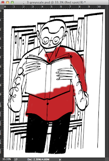
Spot colour channels in photoshop

New spot channel- choosing a colour to represent the ink we are working with


It is important to name the spot colour channel; using the word spot means that the colours are uniquely identified and wont be confused with RGB or CMYK.

Press D - make sure the foreground colour is black; we paint with black to GET OUR POSITIVES FOR PRINTING; spot colours allow us to do both.


Anything that you can do with layers in photshop, you can do in channels too.

Using three inks

selecting colour range- we have the option to create a spot colour channel

Right now, we are seeing a combination of CMYK and spot channels which is pretty confusing.


If we turn of CMYK we can see our positive


We can use brightness and contrast/ levels to see the lighter areas and to see if there are any accidental light grey areas that will affect the print.

Repeating the same process for my second, lighter spot channel.

(remember to select the CMYK layers first before applying the colour mode)


 I now have all of my three colour channels


It also might be a good idea to go into the channel itself and clear up any black marks etc.


When we save, we HAVE to tick the spot box, and it has to be TIFF or PSD, not a JPG.
Open the file in illustrator.

Preview? window menu > separations preview


Illustrator shows each colour channel in the actual colour, which is useful.

Print > mode > separations

Make sure you UNTICK the CMYK printer icon modes


We will then get three positive printouts!

Printing larger than A3

Split channels in PHOTOSHOP, have one for each of the spot colours, save and take to digital print resource

Using half-tones

Using the same new channel> colour range > select the light colour > fill it with grey
then go edit > fill


So the idea here is choosing a different shade of grey for each tint on the same channel layer, and choosing a different shade of grey to represent each colour.


Overprinting or knocking out

A simple two-spot channel image, each separate piece of information is kept in each channel.


Spot channels simulate the transparacy of printing ink.

Solidity value allowes us to alter the transparancy of the ink.


We don't see any change so far in the image. This is all to do with the order of the spot colour channels. Very much like layers, the layer at the top is nearest the front.

If we swap the layers around we notice a change.
Knocking out would be the opposite of over printing.

Monday, 26 October 2015

After Effects 2

Keyboard Shortcuts

Change property/position- select layer > P
Anchor property > select layer > A
Rotate > select layer > R
Scale > select layer > S
Opactity > select layer > T
                                                
Two at once? hold down the shift key 

Move time marker to the output of the active layer > select layer > O

Move time marker to the in point of the active layer > select layer > I

Move the beginning of the work area to where ever time marker is > select layer > B

Move the end of the work to where ever the time marker is > select layer > N

Reveal all of the animated property of the layer > Select layer > U 

Reveal all of the MODIFIED properties > select layer > UU

Key Frames 
 
Moving things as a group > select all of the layers  > P > position property is shown > go to one of the layers > activate key frame > P >

Just change the properties of one layer and all of them will change at once, the position is still relative.

How to change the pace

Select all layers > U > select all key frames > drag the position markers around on the timeline ( distance represents time )

Instead of spacing markers out individually > Alt > choose a key frame with is either right at the beginning or the end of the sequence.

Key frame interpalation 

It's all to do with how after effects manages what happens between the key frames - its easy to see this when we look at motion

When you choose key frames, AE has to make up the motion path between them 

Bezier curvers are associated with the function of a curved line used in illustrator, we can use the pen tool to amend the curves

The change between the key frames is called intrepalation, a line that goes from one key frame to the next


Working with photoshop files- preparing visual assets

Always need to prepare things to the appropriate size

PS- File > new > preset > film and video > PAL D1 DV Widescreen Square Pixel ( this is the exact same preset as AE)


 RGB colour screen/ 150 x 1076


Blue guides specify safe zones in which to work.

Inside rectangle - title safe zone (if you're using text - keep any text within the box)

Outside rectangle - action safe zone - again make sure nothing significant happens outside of this.

 Save asset to put into AE, either PS, JPG or TIFF file

cropping the image doen is helpful when importing to AE to get rid of empty space

Transparency > new > background contents > transparent


We now have three images to work with; a JPG, a cropped version and a transparent background.

Anything that you import into after effects is reffered to as footage.

Instead of getting to file and import for the final image, we just need to double click in the project area.


Sunday, 25 October 2015

Brief Selection: What is the Problem?


Analysing example briefs


Conclusion of the two briefs:


  • I get the impression that D&AD properly want the illustrator to emerge themselves within the project, in terms of actually setting up a presentation rather than solely illustrating a few images.
  • The language they use is interesting... extremely persuasive and aimed at niche/target audiences.
  • It was very useful looking at these two examples and gaining some scope into the extent of what could actually meet the specific requirements
Study Task: Choose a brief to work on

Having looked at all of the brief's on the shortlist, I have decided that I would definitely like to have a go at the Penguin Random House UK Design Award 2016.

http://penguinrandomhousedesignaward.co.uk

I believe that this would be an excellent opportunity to challenge myself on a professional level and widen my skills within my practice. 
The problems I aim to solve are: visually persuading the most suitable audience to pick up the book that I choose to illustrate and read it as well as to create a striking image that would look extremely professional on a physical publication.

First of all I need to have another think about which book I will actually choose, although my thoughts are aiming towards the children's book at the moment because I am aiming to push myself in areas outside of my comfort zone. So in order to solve these problems, I will have to read the book myself and record my responses along the way by keeping a sketchbook and jotting things down for reference, including moods, themes, characters etc. I will also have to do some research, which will entail broadening my knowledge of the specific category of book that I choose, so carrying on the example of children books, I would visit a book shop and analyse a range of covers, asking myself 'would I read this' and 'how visually effective is this cover?'.

Taking part in this live brief would boost my motivation and confidence simultaneously. If I was fortunate enough to win the competition, the prize of a work placement at the Penguin Randomhouse design studios would both increase my knowledge of the publication sector and give me an insight into a career that I could possibly go into.

Thursday, 22 October 2015

Tutor Review & House Group Crit (Critchen)

Review with Teresa:

My queries

  • I feel like I haven't done enough work
  • Concentration issues
  • Overwhelmed because it seems like everyone has done more work than I have
  • Struggling with the longer deadlines
  • List writing obsession is taking over my life haha!
Teresa's feedback
  • I have done a good level of work; lots of research but more experimentation is needed
  • PLAY MORE
  • Don't focus on other people's work, focus on mine
  • With the lists- write a daily ACHIEVABLE list, write one each day instead of each week, then I will feel less overwhelmed
  • Look broader into Oliver Sacks, don;t just draw him and patients, draw and record other things such as hallucinogens 
  • Paper cuts are strong, and so are arrangement skills, play to these strengths
Review with housemates (Tom, Georgie, Naomi and Jack):

My queries
  • I still feel like I haven't done enough work!
  • I still cannot concentrate
  • I still cannot get used to the long deadlines
  • The long deadlines are making my list writing and cleaning coping strategies worse :):):):):)
Housemate's feedback
  • Calm down!
  • You have LOADS of things to work from
  • Go back to basics, draw simple things including science bottles, equipment, any objects to do with Sacks' medical notes
  • More things like LSD, mental health nursing, goofy patients
  • GO BACK AND LOOK AT PREVIOUS IDEAS
  • Have a go at printing, lino or screen or even some more methods
  • Just break things down and start simply.
  • We can set you weekly deadlines if you are struggling
Things I will take forward from here
  • Make daily lists, but set weekly targets and deadlines for myself
  • Go see student advice about concentration problems
  • Start simply with things, don't put too much pressure on things
  • ENJOY IT

Tuesday, 20 October 2015

Digital Print Workshop 1


Digital colour modes:
  • RGB-display of colour on screen
  • CMYK-preparing for print
Where the colours overlap= new colours are created.

Process:

Cyan-yellow-magenta-black (key colour, gives us true shadows and depth of tone in areas where needed)

When we screen print we dont necessarily use the CMYK method; we just get the colour and use it.

Two different ways to apply colour in commercial print process:
  • CMYK- processed colour
  • SPOT inks/colour- a pot of ink that is the colour that you're going to print. 
Why are spot colours used?
  • They can be cheaper e.g. only two inks as opposed to four
  • Branding e.g. logos
  • Allow the accurate reproduction of colour:pantone colour reference- unique number
  • They allow for metallic/flourescent colours to be printed
Preparing for screen printing on Photoshop


Getting the Positives for screen printing
  • Selecting areas using magic wand/select similar
  • Colour range: select - colour range
  • What is previewed WHITE is what will be selected
  • Selection preview: white matt
  • Put it onto a new layer
  • Layer-new-layer via copy (cmdJ)


How do we get the proper positive? It has to be black; so the orange has  to change to black.


Quick way to do this with a transparent background:

  • lock transparent pixels
  • Edit-fill-black 
  • Do this with black as well, just to make sure it is 100% black


Printing smaller than A3
  •  Always check the image is 300 pixels per inch
  •  Image - mode - CMYK
  •  File - save as PS or TIFF file, NOT JPGS
  •  Channels: store information about colour in the image

E.g. Cyan- darker where there is more cyan ink, lighter where there is less


Channels are used to create the positives to print. 

Using Illustrator to separate inks and select our positives: 

Print- output- mode - composite- separations

 
 How can we print different amounts of an ink?

  • When we create our positives we have to create half tone screens.
  • Half tones are the way we can print different tints of one colour in one ink. 
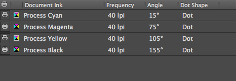
  • Frequency and angles are to do with half tone screens; the lazer printer will create these dots during the printing process
  • Frequency = number of dots 
  • Angle = how much the grids of dots are rotated so they don't clash when printing 
  • Commercial printing: 100-250 lines per inch
  • Screen printing: much coarser half tone scren due to the threads on the screen; 50/65 lines per inch
  • Dots can also be used for aesthetic effect
  • Just two inks? Just use the top two selections.


The angles for screen printing are: 15,75,105,155
The dots are at 40 in this instance so they are visible.
How do we know which is which?
Marks and bleed option- page information 
Printing Larger than A3
Everything has to be done in Photoshop
  • Create 1 image per colour channel
  • Split channels: photoshop then creates one image per channel
  • We need to think about how we are going to do half tones; the printers cannot do this so we have to apply half tone screens to each image.
  • Image - mode - bitmap (only if image is greyscale) 
  • Bitmap: pixels can only be black or white


As long as each screen has a different angle it is ok. The bitmap has to be increased to increase quality. 

Do this to each of the positives, then go and print them.


Lazer printer: use illustrator
Inkjet printer: use photoshop


Monday, 19 October 2015

Animated Shorts/Stings

                      How its made- Teddy Bear


https://vimeo.com/122973299


This sting is based on a teddy bear's frightening vision of how toy bears are actually made, which is both clever and funny simultaneously. I think the restrictive colour palette works really well, using red as a colour of danger, warning and fear that ties in with the main principle narrative of the sting, with the blues and creams complimenting. It is a really clever depiction of perversive thoughts that anyone can experience to do with fear/anxiety/stress, and although it may be seen as quite a serious topic, the use of the teddy bear character softens the serious element, making it feel more entertaining.

E4 E-stings 2015- Whale


http://estings.e4.com

I admired the predominant use of analogue methods in this sting that was entered into the E4 Esting competition. The pencil sketches make it look extremely authentic, and it works so well because the animation flows really smoothly.

The fish and the boy


http://cargocollective.com/SemiColin/The-Fish-and-the-Boy

This sting is a little dark and gloomy but it was made in after effects!I like the way that the images move; almost like moving pictures instead of an imitation of real life figures and objects.