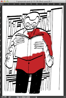
Colour libraries- enables you to choose spot pantone colours
If the mode of the image is CMYK, using a spot in wont be printed with its own ink, it will be reproduced in CMYK.
Can channels be used to contain information about spot inks?
Spot colour channels in photoshop
New spot channel- choosing a colour to represent the ink we are working with
It is important to name the spot colour channel; using the word spot means that the colours are uniquely identified and wont be confused with RGB or CMYK.
Press D - make sure the foreground colour is black; we paint with black to GET OUR POSITIVES FOR PRINTING; spot colours allow us to do both.
Anything that you can do with layers in photshop, you can do in channels too.
Using three inks
selecting colour range- we have the option to create a spot colour channel
Right now, we are seeing a combination of CMYK and spot channels which is pretty confusing.
If we turn of CMYK we can see our positive
We can use brightness and contrast/ levels to see the lighter areas and to see if there are any accidental light grey areas that will affect the print.
Repeating the same process for my second, lighter spot channel.
(remember to select the CMYK layers first before applying the colour mode)
I now have all of my three colour channels
It also might be a good idea to go into the channel itself and clear up any black marks etc.
When we save, we HAVE to tick the spot box, and it has to be TIFF or PSD, not a JPG.
Open the file in illustrator.
Preview? window menu > separations preview
Illustrator shows each colour channel in the actual colour, which is useful.
Print > mode > separations
Make sure you UNTICK the CMYK printer icon modes
We will then get three positive printouts!
Printing larger than A3
Split channels in PHOTOSHOP, have one for each of the spot colours, save and take to digital print resource
Using half-tones
Using the same new channel> colour range > select the light colour > fill it with grey
then go edit > fill
So the idea here is choosing a different shade of grey for each tint on the same channel layer, and choosing a different shade of grey to represent each colour.
Overprinting or knocking out
A simple two-spot channel image, each separate piece of information is kept in each channel.
Solidity value allowes us to alter the transparancy of the ink.
We don't see any change so far in the image. This is all to do with the order of the spot colour channels. Very much like layers, the layer at the top is nearest the front.
If we swap the layers around we notice a change.
Knocking out would be the opposite of over printing.


No comments:
Post a Comment