Intentions
From my last crit, I decided to focus more on the symbolism of these pieces, in particular focusing in on the meaning of hands and of the colours I choose to use.
I have produced some more developed rough sketches as to how I'd like my postcards to look, this time with each pair of hands being in similar positions in order to amplify the meaning.
Practical Skills
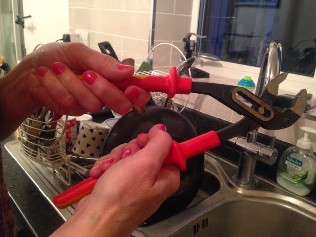
I took some photographs of my mums hands in appropriate positions to draw for my postcards. This way, I wouldn't feel as though I was just simply copying another image when using illustrator.
Intentions
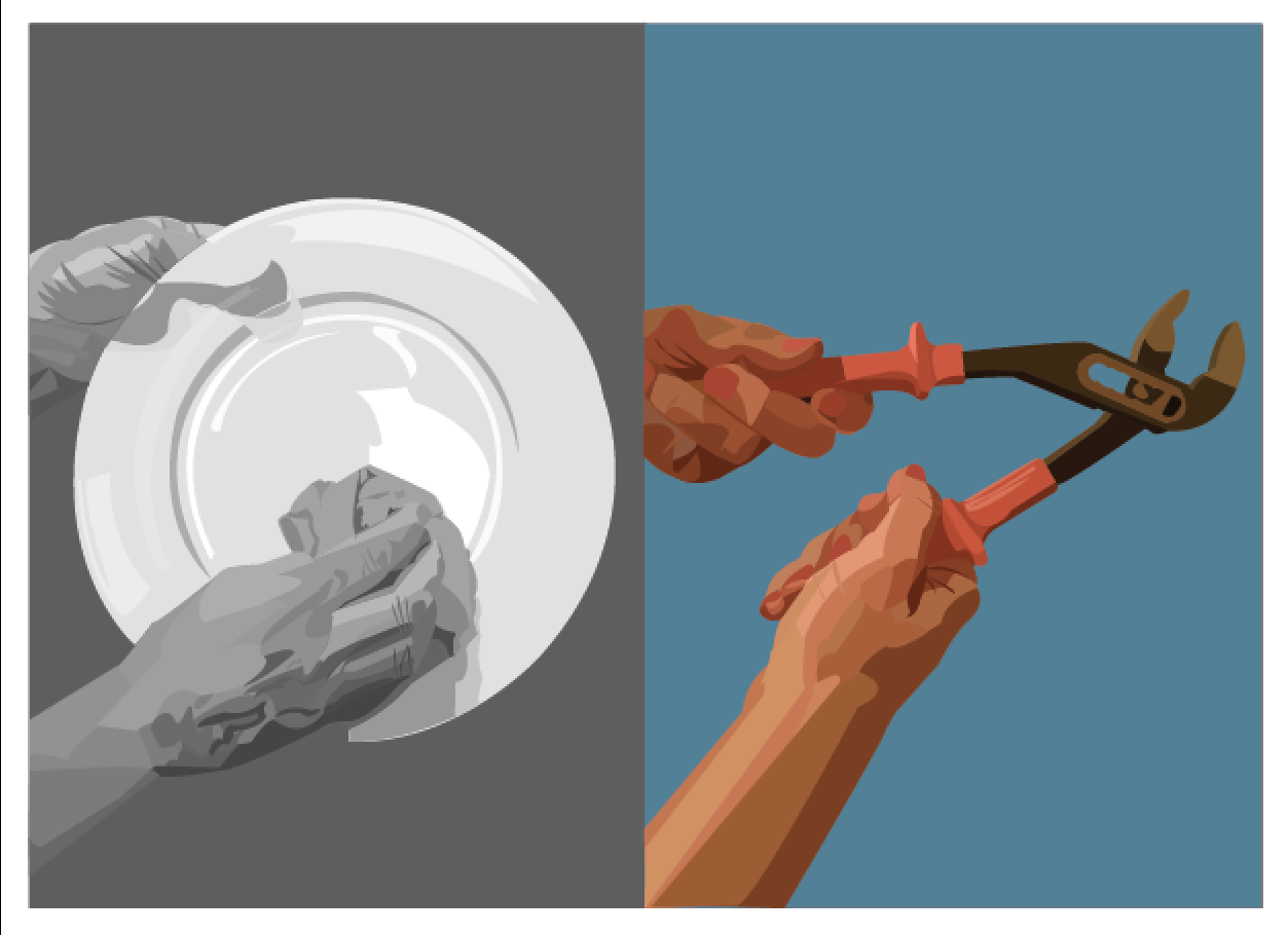
I decided to convert the colour of the first image (of normal every day women) to black and white. This represents the fact that most women in the 1930's lived in a sexist society where they were undervalued, in a dampened lifestyle without having prospects for a bright future.
Using Illustrator, I selected different sections of the hands using the picker tool and drew out each shape appropriately, I soon realised that this was an extremely lengthy process and would take a lot of care and patience.
I found it easier to use a wacom tablet in this process to select each anchor point more quickly and accurately.
From tracing photographs, I was more prone to leaving gaps in between shapes which was frustrating, but easily amendable by using the direct select tool and filling in the blank spaces.
Problem Analysis
One of my peers suggested that I could maybe reflect the position of the hands on the postcard so that it gives a more symmetrical effect. However after testing using the outline of the second image in relation to the first, I decided to stick with my original layout. Having it reflected brings the line of sight towards the centre line of the postcard, rather than allowing the viewer to see the comparisons and similarities between the two images.
Again, the tracing of the photograph was quite a lengthy process but I managed to complete it to a good standard.
Problem Analysis
When it came to arranging all of the elements onto my postcard, I realised that the right hand in the second pair was too short for the image, giving the impression that it was floating in air.
To amend this issue, I used the direct select tool and extended the end anchor points down to the bottom of the border.
Colour Symbolism
My options were either:
- Red- Symbolising bravery, courage, danger and excitement
- Blue- Symbolising stability, leadership, strength and truth
Although red would have been the most appropriate background colour to use, it seemed to clash a little with the skin tone. The blue was more complimentary to the skin tone, but the red symbolism is still visible with the handles of the wrench.
The Final First Postcard
Reflection
The outcome looks exactly as I hoped it would thankfully, I am pleased with the position of the hands, how they look having used vectors and the overall message that the image communicates.
I will continue this colour theme in my next two postcards, having one element in the coloured photo being red, representing everything that Amy Johnson stood and acted for.


No comments:
Post a Comment