Intentions
The third postcard has the most striking message of the three; choosing a career and achievement over motherhood. Most women, even today see becoming a mother to a child as one of life's most precious aspects, which isn't a bad thing at all, but this completely contrasts with Amy Johnson's views.
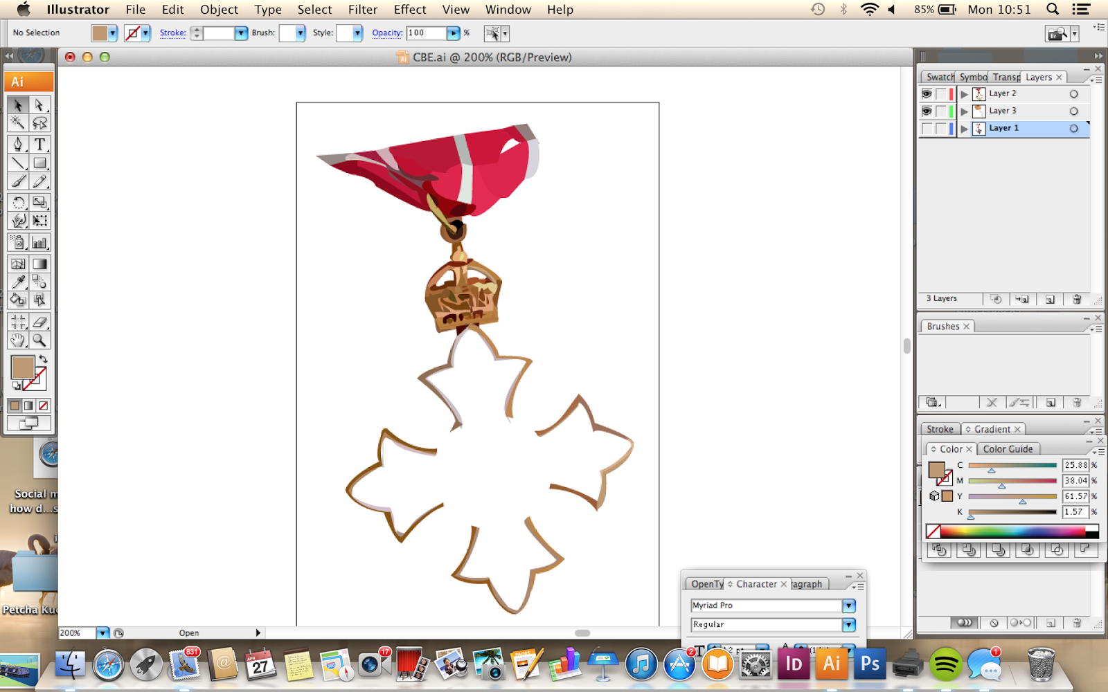
Holding a CBE medal in the same way that a mother would hold a baby symbolises the fact that Johnson strived off achievement, setting targets for herself, breaking records and gaining rewards.
Practical Skills and Development
Perhaps because this is the most sensitive and delicate of the three postcards, it took a lot longer than the others. However this could be because in the time I have spent drawing hands on Illustrator, my skills have noticeable improved from the first postcards with regards to attention to detail.
Difficulties
I did have a hard time trying to complete this postcard because I felt exhausted from staring at the screen for so long and having to concentrate on each segment of the hand with full attention to gain the best visual outcome.
I also kept asking myself, 'is using Illustrator cheating in a way, as I am just tracing a photograph?' However I was pleased with the outcome of the first two postcards, and this kept me going to complete it.
The worry did arise that I haven't done enough media testing, and just used Illustrator as an easy way out. Yes I probably should have done a few more media tests to broaden my practical development on the subject, but as I have learnt by drawing out these postcards, Illustrator takes a lot of time and patience!
The baby took quite a while to complete, as I wanted it to look real and less like a plastic doll! To help this, instead of drawing his/her eyes open, I closed them to make the image seem more delicate as opposed to having a creepy-looking baby staring into the viewers eyes, and distorting the meaning.
Here, I encountered a similar problem to before, with the photograph not being long enough to fit in the frame on the final image, therefore I had to do some guess work and figure out where the baby's clothes would crease, using the appropriate shades of grey.
At this stage in producing the postcards, I think that the more time and practice taken out on drawing out the hands, the more visually pleasing they look.
Comparing my first and latest postcards there is a huge difference in visual quality which has come with the development of my skills using adobe Illustrator.
The Final Part
I produced the CBE on the morning of my print slot which I felt was a bit risky, but I had to get on with it. In hindsight, I wish I would have drawn out the medal by hand and traced it, rather than tracing a secondary image. Also, the outcome looks a little rushed and not as detailed as it could have been, but at this stage the most important thing was to finish everything ready for my print slot.
The Final Third Postcard
Reflection
I am actually really pleased with the outcome of the last postcard. I feel that I have fulfilled my intentions to include symbolism in a sensitive way and I'm glad that the time I have spent into crafting the hands in a digital way (something that I wouldn't have even thought about doing a few months back) has paid off with a good standard of visual quality.


No comments:
Post a Comment