Research
To gain some initial ideas, I tapped 'Amy Johnson Stamps' into Google images, and there have actually been some stamps printed based on her and her flying career.
These stamps are aesthetically pleasing, but don't really have much meaning behind them, whereas I wanted them to get across a message.
Critical Incident
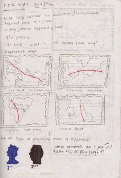
In my earlier roughs, I thought about showing the maps of Johnson's journeys in my postcards, however I thought that these may be more suitable in stamp format.
Intentions
I intend to make four stamps showing the progressive distance in which Amy Johnson flew:
- London to Hull
- London to Moscow
- London to Capetown
- London to Darwin
I also thought about making the stamps look like they were from the 1930's. I researched stamps from that era, how much they were and the monarch at the time, which was King George the Sixth, who's head appeared in the top right corner.
Practical Skills
Again, to keep in the theme with the poster, I decided to use Adobe Illustrator to create my stamps.
I used a stamp template to gain an accurate scale of the white frilling around the image.
One of my major kryptonite's in any project is coming up with an appropriate colour palette. I really struggled to come up with some appropriate tones to use in my stamps.
I did some research into 1930's maps, as advised in the most recent crit, and found the sepia tones of colour really interesting and fitting to my theme.
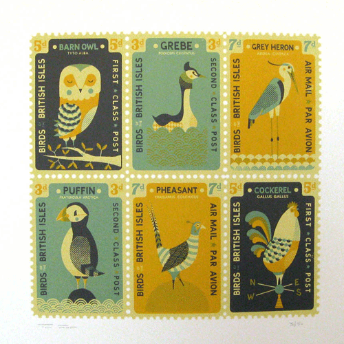
Whilst browsing the internet searching for inspiration, I came across printmaker, Tom Frost's work involving postage stamps.
The colours that he has used are really beautiful. The muted, sepia tones bring about a vintage kind of feel, and works extremely well only using three or four colours in each set.
Using the colour picker, I applied the same colours from the vintage maps to the sea and land in my images, which looked a lot better.
Problem Analysis
When creating the journey route, I couldn't find the dashed line option. I went onto the line option at the top, and the only dashed line there was looked too stark and uneven.
Problem Solving
To solve this issue, I drew little squares over the lines on another layer in the colour of the land, to give the dashed effect.
The next part to the stamp was tracing the silhouette of King George's head to be placed in the upper right hand corner, and also adding the value of the stamp. Through my research, I discovered that the 'D' on old fashioned stamps comes from the latin word 'Denarius', meaning pence.
The first finished stamp:
I carried out the same process for each of the other three stamps, the only differences being the higher complexity in shapes to trace, and increase in value of the stamp.
I am pleased with the outcome of the stamps. Like the poster, I will gain some feedback at a later stage from peers and see where I need to make any amendments or finishing touches.


No comments:
Post a Comment