- To convey its own intrinsic beauty
- To divide or limit an area/space
- To delineate a thought/symbol
- To define a form by edge or contour
- To catch and direct the eye over a given course
- To produce a grey/tonal gradiation
- To create a design or arrangement
Illustrators renown for their use of line work:
 |
| Ben Shahn |

 |
| Ceri Amphlett |

 |
| David Hockney |
 |
| Picasso |
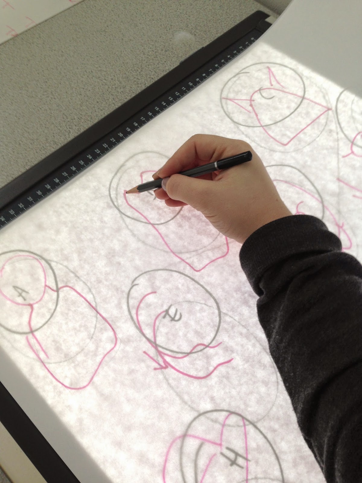
Our task is week is to produce four drawings of three chosen 'dynamic poses' relating to our chosen theme. We have to draw each pose three times using different media and tools, and they have to be constricted to monochrome.
Intentions
Pay attention to the quality of line, and take into consideration the seven functions of line when producing these images.
Work Made


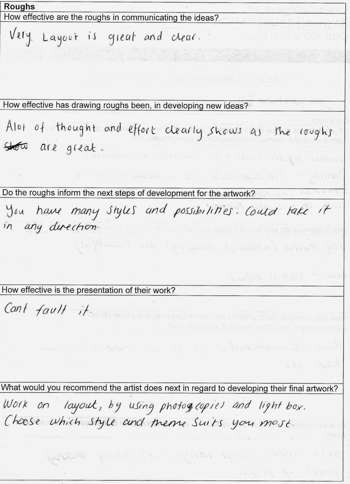
Evaluation of Outcomes
Admittedly I did rush some of these drawings to get them completed in time for the deadline, so next time I shall give myself plenty of time to engage in the activity fully to produce the best outcome. I also need to consider the fact that it is important to document my development against the learning outcomes to enable to progress.
Visual research- I was quite playful within my first image. I used materials that I wasn't familiar with (graphite and dip-pen) and overlayed them to make an interesting image. I feel that I could have experimented more with ideas and speculation, for example I could have further explored themes such as facial expressions more subjectively.
Problem analysis- The variations of my drawings are quite successful by using different drawing techniques, however I could have pushed myself further and out of my comfort zone by exploring unfamiliar processes, such as collage/using different processes etc.
Visual variation- I did experiment to a certain level, but I could have pushed the boat out further. I could in future explore further into sports artists and illustrators and find out how they encourage their practices.
Professionalism and presentation- I tried to focus on composition and layout of my drawings within the pages, however with figurative drawing I am not very accurate in measuring the correct space for the figure (hence why the bottom diver has no feet). This is something that I need to work on.


