Friday 29 April 2016

Planning and Roughs

I have a week to go until my print slot next Friday, and I feel confident in that I have planned ahead in terms of production of my final products. I am not quite sure about the designs in particular that I will use just yet but I intend to decide over the next few days.


Developed Type

I have found that practicing drawing out the letters has increased the level of accuracy and presentation, and I now have a few different styles that I can use. I've also found/made up a few little quotes that will feature on the postcards and badges alongside the imagery. When it comes to producing the final outcomes, I will probably select and copy selected letters over to the blank canvas, which will allow me to save time and experiment further to find the most suitable layout.

Rough Sketches

In the same way that I plan to select and copy the well constructed letters over to the blank canvas, I will do the same with the range of patterns that I have made which include:

  • Bees
  • Stars
  • Suns
  • Flowers
  • Clouds and Raindrops
  • Tea
  • Cactus'
I would prefer to construct most of the outcomes by hand to emphasise the handmade craft element of my project, however working digitally at this stage will allow me to explore potential layouts, patterns and ranges of products that I can create following the self-care theme.

Tuesday 26 April 2016

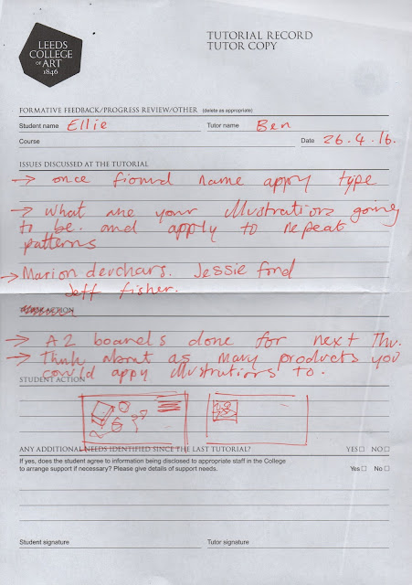
Progress Tutorial

Today I had my progress tutorial with Ben feeling like death because I had just done an all-nighter for COP (cries). So naturally, due to the stress of COP being due in Thursday, I haven't been able to give 505 the attention it has needed in the past week.


Although we were both happy with the work I have done so far concerning handmade type, and how I can develop this further with context and imagery. We also talked about where this style of working could go further for me as I am really enjoying developing my hand-rendered skills. There is scope for me to develop pattern making within my imagery as well as combine it with digital processes I am already familiar with that would start to build on a stronger tone of voice.

Ben also gave me some illustrators to have a look at that work in a similar way to me at the moment.

Jeff Fisher

Fisher doesn't use any digital methods whatsoever! I feel like his work is extremely traditional in terms of the colour palette; the darker and muted shades provide a really authentic feel. There is such a high level of craft and care within the aesthetic, which is applied well in a contemporary context.


Jessie Ford

I feel as if my work has a stronger connection with Jessie Ford's, in the fact that she uses a brighter and more striking colour palette and really beautiful textures (that I hope to become good at!) I really admire how her work can be applied to a number of different contexts, for example book jackets, packaging for food and drinks products and most importantly, her motivational quotes.
Marion Deuchars

Deuchar's work is WONDERFUL! Less focused on imagery, the emotion and purpose is crafted so sensitively within her hand made type. As well, the context of her work is inspiring, especially the violence against women campaign.


Luckily, I am ~surprisingly~ in a good position with the project with less than two weeks to go, the steps I need to take now are:


  • Choose my quotes for the postcards
  • Come up with a name for the product
  • Choose a colour scheme
  • Patterns
  • SLEEP!!!!

Sunday 24 April 2016

Colour and Pattern

Colour

Colour schemes are always something that I struggle with developing accurately as my colour theory skills are a little bit patchy. Having a strong colour scheme is an integral element to my final designs, as the aesthetic needs to have a strong association with positivity. 

I constructed a mini questionnaire and asked my classmates the following questions:

  • What colours make you feel happy, relaxed and uplifted?
  • What patterns and shapes make you feel relaxed?


The main outcomes accumulated to pastel colours and smooth, circular shapes as anything too stark/harsh would defeat the object of the calming theme of my project. 

To help me develop an appropriate colour palette, I had a look at a really helpful website called http://colorpalettes.net/color-palette-2772/ , which displayed a range of five-colour palettes under specific themes such as pastel, warm, cool, contrasting etc. I picked out a few palettes in particular that I thought might work well within my project and included some of the suggested colours from the questionnaire. From this, I was able to develop my own ideas by testing out the most effective shades within my sketchbook and scanning them in to create my own panel.

The chosen colour palette is balanced, calming and fitting to my theme. I was a little worried about using the colour pink, as I intended the product to be non gender stereotyped. However from observing and gathering opinion I came to the conclusion that the market for self-care products and stationary was predominantly female-based, although I haven't developed the aesthetics to fit women-only interests.

Pattern

I was slightly more confident with pattern than colour due to the fact that the outcome doesn't have to be perfect first time. I used a combination of black ink and fine-liner to develop some shapes and images that I thought would be fitting to a calming theme (despite the stars being geometric and the complete opposite of what people suggested).

Plan of Action

  • In the next few days develop some more patterns
  • Start applying the imagery to mockups of final deliverables
  • Combine them with the colour palette

Monday 18 April 2016

Software Workshop: Building a Net

Having decided on making an activity/sensory box filled with visual aids to ease stress, I gathered that the first step would be making said box. I attended a software workshop with Steve and he helped me to get all the dimensional parts right (I am useless at maths!) The important things that I needed to consider were:
  • How big I want my box to be?-Roughly A4 sized?
  • What kind of paper stock shall I print onto so that the box is durable
  • The lid needing to be bigger so it slides on 'snug'
  • Visible folds
  • Will everything actually fit inside the box?

Nets and Mockup


Here are the base and lid nets with a half-sized mock up made with A4 paper. I am happy with the way that the box works, it is simple and effective and the finished product will be sturdy and decorated with relevant patterns.
From here I have been able to gain a sense of the actual physical products that I intend to produce, which has really motivated me to aspire to develop a really strong response. 

By the end of the week I aim to:
  • Finalise everything that is going inside the box
  • Make more mock-ups
  • Start exploring colour and pattern

Saturday 16 April 2016

Handmade Type

I decided that I would use some sort of handmade type within my work as it would give a more softer and crafted effect as opposed to using a digital typeface.

The book, 'Hand Job' from the library includes a whole range of artists and illustrators that have used handmade type within their practices. In particular I was a fan of Kate Bingaman-Burt who used a combination of hand written upper and lower case letters with illustrations created in fineliner. Her aesthetic is simple, charming and friendly (if drawings can be friendly?) working across many different media forms. 

My next three favourite hand-written typefaces are 'Adelaida','Heart and Soul' and Lisa Congdon's handwriting in the book, 'Whatever you are, be a good one'. I admire these in particular because they are delicately constructed and creative at the same time, as opposed to typical scrawly unable to read handwriting that a lot of people have. 

Adelaida is often associated as 'the hipster typeface', as many alternative stores such as Urban Outfitters use this within their products, and it is commonly used within online blogs and other products aimed at a younger audience. Its long and thin structure using upper case is gentle yet assertive and also easy to read, probably why it is so popular.

In contrast, Heart and Soul is particularly classy and in some ways quite feminine with its curled serifs and joined-up style. This too is popular among a young target audience, yet like Adelaida I get the impression that it is a little over-used? Although, it is so pretty, and it also comes with lots of delicate swirly patterns to add to the high decorative standard.

Lisa Congdon's handmade type is similar to Kate Bingaman-Burts in the fact that it is very charming and unique. Congdon uses a number of different original typefaces, some more curly and some more long and straight which shows strong versatility alongside her illustrations.


Experimenting

I had a go at copying out the styles of the different illustrators handmade types to get a feel of how they are constructed and how much accuracy and craft is required.

Despite how visually pleasing these typefaces may be, I thought it would be more original and challenging for me to develop my own hand type style, taking some inspiration from these to create a strong and appealing aesthetic.


Usually my handwriting is a bit too curly and unreadable, but putting more time and craft into each letter has enabled me to produce quite a good handmade typeface which I am happy with, and would be confident to develop and use in my final products. 

Plan of Action

  • Find/come up with some quotations to use in the final outcomes
  • Practice these in a number of different styles and materials

First Mockup: Sensory Box


What is a sensory box?

Sensory boxes are used for practicing self-soothing in times of stress, anxiety and low mood. It contains elements to focus and calm yourself through the five senses:

  • Touch
  • Taste
  • Hear
  • See
  • Smell
My Response

I thought of a few ideas for each sense to try out in a sensory box mock-up and narrowed it down to the few that I thought would be the most effective.

Touch: Bubble wrap, play-dough, modelling clay, stress ball, precious stones
Taste: CHOCOLATE?! Or mints?
Hear: ~this one is difficult~ I might just make a notepad/playlist list pad?
See: Motivational postcards, posters, badges, activities, stickers
Smell: Scented candles, incense sticks, lavender bags


Context

I discovered that The Sad Ghost Club ran a workshop on how to create a sensory box back in January, which was aimed at the target audience that I am looking at! (I feel like I am basing the entirety of my project on the sad ghost club but I promise that I am not copying and that I thought of the idea before I discovered it!)


Process

I gathered things from around my bedroom, and went out and bought a few bits and bobs to put in my mock-up box (the box I used was one that I bought some fairy lights in!) that was just a bit larger than A4 size. 

The contents included:
  • An emergency chocolate bar (taste)
  • Motivational postcards x4 (see)
  • A 'happy songs' playlist list (hear)
  • Incense sticks (smell)
  • Bubble wrap (touch)
  • Baby Cacti! (not sure about these, but thought it might be a good idea for having the responsibility to care for something?)


Good Points
  • Good starting point, set a strong foundation in which I can build on
  • Appropriate use of imagery and language
  • Five senses are attended to accurately

Points I can improve
  • Refine the imagery, create patterns and colour schemes specific to the target audience
  • Does it need to be sensory? Might have more potential to develop if it was based on image based and illustrative solutions
  • Don't think I need the cacti...
Reflection

My first mockup was successful in helping me refine what will actually go inside the box. Through testing out the specific concept of a sensory box, I have discovered that maybe this isn't the most suitable path to follow, and that perhaps I should explore more image based solutions that place more emphasis on the content of the design, rather than the product (chocolate being an example). This mock-up has also been helpful in terms of planning sizes; I realised that this box is pretty big, and would take a lot of content to fill it, therefore I will scale down the size a little.

Plan of Action

Over the next couple of days I plan to decide on the final contents within the self-care box, then develop the appropriate nets and file documents in Illustrator and Indesign, which will set me off in the right path to developing appropriate imagery, pattern and language.

Thursday 14 April 2016

OUIL503 End of Module Evaluation

Responsive has by far been the module that I have found the most enjoyable and most valuable this year. Being challenged to enter live briefs on a national and local basis has increased my level of motivation for illustration as a whole. Moving on from my first-year perspective of making a piece of work that will just be viewed by my peers inside of college walls has allowed me to develop a greater sense of knowledge about how I can apply my work to areas, audiences and markets that I didn’t necessarily consider previously, or have the confidence to explore and experiment with.

One of the main things that I have tackled head on is my low confidence in my ability; during the initial months of the module I got off to a slow start due to being completely overwhelmed at the thought of submitting my designs to real competitions against thousands of other applicants. It was a real wake up call, but I stuck to my motivational rule of ‘say yes to everything’, and told myself that I ‘whatever I produce, I will have gained a new skill or way of working. I have only been doing this course for a year and a half, and I am still learning new things everyday, and mistakes are inevitable and will help me to learn more about where I can develop further down the line’.

Throwing myself in at the deep end was beneficial and surprisingly fun, and has helped me to strengthen the process in which I tackle a brief. However this approach also had some down sides, including wanting to take on every brief because I eventually became over-excited about trying new things out. So naturally, the vicious cycle started. I finally gained some motivation, I became too motivated and set myself unrealistic goals, I became overwhelmed by the whole thing. To overcome this, I decided to start with Illustration Friday, which eased me into the module with weekly quick-fire, simple briefs that didn’t have too much pressure on the principles of process and submission.

Once I became familiar with the format of the module and overcame my perfectionist habits that were holding me back, my main aim became to try out as many different things as possible. For example I chose briefs that focused around things that I had not had previous experience in e.g. Secret 7, having to listen to music and design a record sleeve in response and designing book jackets for the Penguin Design award. Although this has been extremely informative on a personal level, I sometimes found myself becoming too focused on the idea that I was learning a new skill, and the purpose of this module was for me to develop my contextual skills; when in fact I didn’t place enough emphasis on prioritising the client and answering the brief according to their preferences. 
Another factor on this note was that I set myself mini-challenges within some of my briefs to get used to working under certain restrictions and to specific themes. This was helpful within Illustration Friday as I set myself the task of only using digital tools to complete the final image, which urged me to try out new methods and processes within Photoshop and Illustrator which was extremely beneficial. In Secret 7 I gave myself a set colour scheme and worked with symbolism of different varieties of birds to communicate the themes within the lyrics of the tracks. I found that in hindsight, this may have been a little too restrictive, and prevented me from developing potentially more successful ideas further.

Something else that I struggled with a lot was time management. This seems to come up within every module evaluation, but I found it so difficult to gauge how long to spend on each brief and how to prioritise Responsive at times where there was greater pressure on other modules. It’s not a case of being unorganised; I planned out my time really carefully using timetables for each week, which I planned backwards from the deadline to ensure I gave myself plenty of time to finish work in time. I know I definitely spent too much time on Illustration Friday briefs, as I carried out more research and planning than was necessary and also my children’s book cover Emil and the Detectives required so much time to apply additional intricate details to appeal to the younger audience. Looking back now, I probably took on more briefs than I was capable of completing, which forced me to rush some of the outcomes, which is relatively unprofessional and dissatisfying for both me and the client. This is the main aspect that I will strive to improve on when taking on briefs after this module.

To conclude,the list of skills and important lessons learnt during this module is almost endless.

From collaborating with other creative students on a brief to having to physically pitch my designs and ideas to the team at Plusnet, my range of skills and level of confidence has excelled. A big part of this module was about applying my existing knowledge of illustration to real life products and situations, which involved a lot of trial and error due to the extensive process of learning and developing which often resulted in my final outcomes being weaker than I had anticipated. However, now that I have developed skills such as having to read and listen and visually interpret, and working to specific formats in mind of particular target audiences, I can continue to develop my concepts and ways of working in the future.

Project Report

Wednesday 13 April 2016

Collaborative: Individual Boards

Substantial Brief: Presentation Boards

Quick Briefs: Presentation Boards

Plusnet Brief


Brief: To design a mural for the wall in the carpark at the Plusnet building in Leeds. The design does not necessarily have to contain elements of the Plusnet branding, but will need to include the key principles of the business as well as an element of 'Yorkshire Charm.

Response: This was a very quick turnaround brief for me due to the late date in which it was set. I wanted to design something that would refresh the minds of the employees in the office block at plusnet, so I thought about creating a mural of a Yorkshire scenery to divert away from the hustle and bustle of the city. As well, I had an idea about playing on Yorkshire dialect, where I came up with the ideas of the birds making small talk on the wire saying 'fancy a brew?'. 

Pitching my presentation was a really valuable experience, as it helped me gain skills in confidence and communication with a real panel of judges, which was quite nerve wracking! Although I was kind of disappointed because I feel like my final design was not as strong as it could have been, and the judges picked up on this too as they preferred my initial sketches of the birds talking in the trees. 

All in all, this was a short and sweet valuable experience which I have learnt a lot from. I am looking forward to participating in the construction of the winning mural!

Tuesday 12 April 2016

Mega Crit

I felt VERY under-prepared for today's mega crit, and I am pretty annoyed at myself for not being as productive as I had planned during the Easter break. Although having re-written my project proposal and time plan, I feel a lot more on track than I did a few weeks ago. Today was just about refining what I actually have to do, and planning the steps in which I will do it!


My feedback gave me a boost from being stuck in a rut with this project and feeling slightly behind from the pressure with the responsive deadline in two days.

Talking with Teresa really helped me to refine my concept more, and think about the range and distribution methods too, as I hadn't really considered this enough previously. We discussed producing care boxes for different age groups, for example children, really young teenagers and the elderly. This increased my enthusiasm for the project, and I am not determined to really get cracking with my ideas, and develop a set of really effective outcomes.

Plan of Action
  • Produce mock-ups of the content within the box, developing and refining each time
  • Attend a software workshop just to gain some advice on printing processes, constructing nets and appropriate paper stock to use
  • Keep experimenting within sketchbook