Thursday 26 February 2015

Line of Sight

What is line of sight?

The direction you eye moves in when looking at an image.

What does line of sight do for your composition?

Focuses the viewers attention on the most important thing in the image.

How does movement relate to line of sight?

There is a movement of the eye when it is subconsciously drawn to a specific part of the image.

What relationship does the frame have with line of sight?

Crops into the most important part of the image and adds to direction.

How does the handout recommend you use line to its full advantage?

Recognising tools, using the elements to lead your eye to the most important elements. PLAN THE LINES FIRST!

Do you disagree with anything in the handout?

One line must lead to another; this is not necessarily true.

Critical Task
Find an image with an interesting line of sight. As a group, deconstruct each others images adding the directions in which the eye moves.


My image is extremely simplistic; leading lines to a centre piece of a simple tree. Admittedly the image is quite boring, and not very interesting as the line of sight is extremely obvious.

Other peoples images included complex scenes where the line of sight was difficult do distinguish due to the vast amount of information in the image, and others had very interesting lines of sight, for example a 'Zed line' acting as a sort of zig-zag movement of the eye across the image.

Practical Task

Produce a finished piece of illustration of TRANSPORT. It must compositionally employ a story, one of sight as well as depth viewpoint and frame.


Mind-mapping initial thoughts


For inspiration I took a look at a London Transport poster book from the library; many of the old posters consist of illustrated scenes from the early and mid 20th century. The specific posters that I analysed the most had either interesting forms of transport e.g. penny farthings or an interesting composition.


My initial roughs were mainly centred around the scenario of being stuck at traffic lights/ a zebra crossing due to a particular circumstance; I looked at the Beatles Abbey Road album cover to gain a better perspective of drawing a zebra crossing.

Work Made


 Shortly after, I came up with the concept of a sloth crossing a road and holding up a queue of traffic. I looked at some reference material of sloths and cars and then began producing some thumbnails. 

Additional Reference Material


I was unsure of how to make my composition interesting and emphasise the other elements such as line of sight and depth; I then decided that the 'Zed' line would be quite interesting in terms of line of sight.


I decided that the line of the hills would lead to a focal point of the sloth and the car; they are the most important elements of the picture, dictating the narrative the most clearly.

Making a rough sketch of where the lines in the image would be situated before using a lightbox to create the final image.


The Final Image


Evaluation

I used watercolour as my source of media, and green as my colour to break up the black and white. Sticking to the rules of everything we have learnt so far; I emphasised the bold tones in the colour of the foreground to lead the eye there first, also with the help of the line of cars drawing the eye down from the top of the page. 

The image dictates the situation clearly. The sloth is taking a long time to cross the road and the traffic has built up for miles resulting in some very angry motorists.

I have tried really hard to combine all the techniques that I have learnt in the correct way, some may not be as strong and technical as possible but the main thing that I think I have achieved in this image is the sense of narrative being made clear to the viewer.

Monday 23 February 2015

Greetings From... Introduction

Task 1: Find an Illustrator who works primarily with shape.

Yoni Alter


On the theme of postcards, Alter has created these images using vectors combining silhouettes of well known buildings in particular cities. The specific cities are easily distinguishable even without the use of text at the top of each image. This shows clear communication and understanding from the viewers perspective.


A lot of Alter's other work is mainly based around coloured silhouettes of cities and landscapes.


I See Faces Final Evaluation

Viewing the classes GIF's was so interesting; especially analysing the different methods and tools people went through to achieve the desired effects.

I am actually really happy with the outcome of my GIFs; they took a lot more time and effort than I'd predicted. I still believe there is room for improvement in some places but the main thing is that I was able to communicate clearly with the audience with the narrative of each GIF, and in some places gained a positive reaction.

Giraffe on a Bike


I have achieved a realistic sense of movement with the peddling of the bike and clouds passing by. The sense of narrative didn't come across as clearly as I'd hoped in this GIF. The Giraffe was supposed to be riding a young girls bike(possibly his daughters?) to work because he was running late; however it looks as if the Giraffe is just riding the bike aimlessly. 

The narrative could have been made clearer if I had added colour and texture, for example making the bike pink to symbolise femininity; however on the other hand I believe there is something quite simplistic and charming about the GIF being in black and white. I also used a WACOM tablet for the first time in this GIF to emphasise the bold lines, making it clearer to the viewer.

Geoff the Gent


I actually really like the hand-developed feel that Geoff has, although I have used the wacom to touch up areas, and used scanned in textures, I think the whole image portrays a sense of my tone of voice in the actions, movements and narrative within the character.

To improve I could have paid more attention to detail when drawing out each frame. Towards the end of the sequence, his facial shapes and details don't match the first frame as much, however other elements such as his hairstyle and outfit still explain visually that the character is consistent throughout.

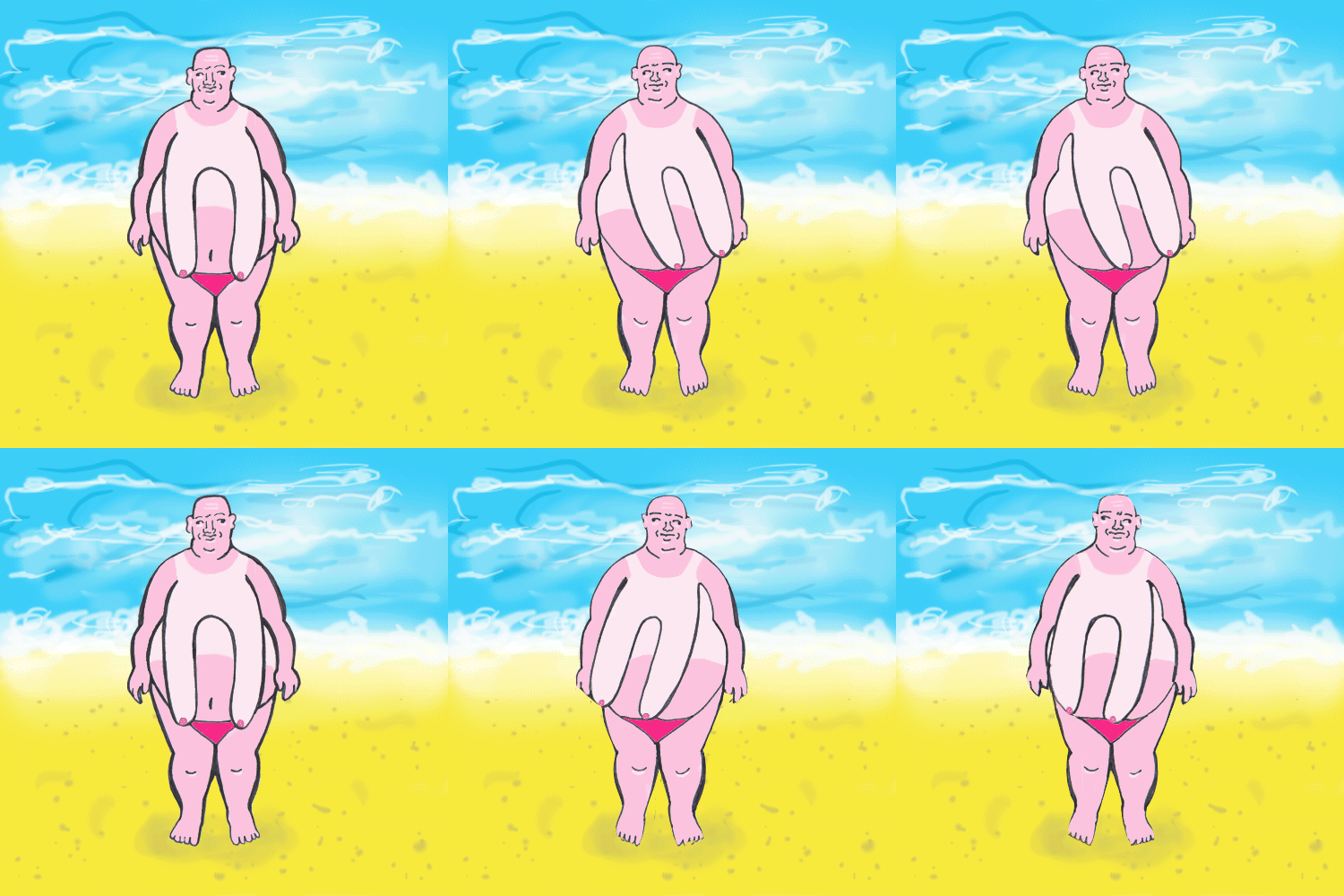
Man Boob Man


Man boob man is my least favourite GIF, this is because I spent the least amount of time on him. The animation isn't as smooth as I'd hoped due to lack of time, and also due to this reason I wasn't able to develop further potential for more complex movement; in my initial planning stages I hoped that he would jump up and down using his moobs as a skipping rope.

However, man boob man did achieve a positive reaction from my peers; it still contains a humorous element and the narrative is made clear by visual elements such as the scenery and the sun burnt detail on his skin.

Overall Evaluation of I SEE FACES

Knowledge and Understanding

I feel that I fell short on this outcome; due to having to go home twice during this week I found it difficult to concentrate and find time to complete the character development task to my full potential. Although in a short amount of time I was able to come up with some strong ideas from the things I find amusing stimuli, which I carried through until the end.

Cognitive Skills

Throughout the brief I was always self-aware of my intentions, and came up with effective solutions for difficulties I came across.
However I feel like I need to evaluate and plan my time more wisely in estimating how long certain tasks will take to complete, leading up to the final outcome.

Practical Development

I have developed my practical skills in learning how to animate a GIF for the first time, and being informed and involving myself in learning animation techniques such as stop motion, and using a lightbox to create and adjust frames accordingly.

Conceptual Development

My concepts have developed through testing ideas, aspects of narratives and different media. The main aspects and quality of each character is shown clearly through small stories or elements within the frame e.g. the beach scene for man boob man and the situation of Geoff's bogey.

Key Transferrable Skills

During learning and adapting to using a new skill, I wasn't able to predict and plan my time as wisely as I'd hoped, which resulted in production being slowed down and decreased quality in some of the outcomes of my GIF.

Man Boob Man

Problem Analysis

I am at a stage in this brief where I have realised that I have over -complicated all of my GIFs without realising. All of my proposals have included complicated movements and sequences, which has decreased my time allowance. Therefore I haven't had time to develop my man boob man character to the standard that I had hoped for.

Initially I had hoped that he would jump and skip with his moobs, however I have spent the majority of my time developing and completing my other two GIFs; therefore for my finished GIF of man boob man I will develop the initial swinging GIF.


Practical Skills

I started by composing a simplistic beach scene background in photoshop.


Using a lightbox and stencil image of a large man, I drew out a basic shape for man boob man in which I was able to adapt my character from.


Using the same technique as in previous GIFs, decreasing the opacity  when adding a new layer, I was able to position the figure accurately against the background.


I decided to give him a sunburnt look, with a cringey wife-beater vest tan line to add give a more humorous effect and to create more of a theme; this was achieved by using the magic wand and brush tool.


In my frames, I only drew his moobs swinging to the right. To save drawing out extra frames needlessly, I selected the figure on a new layer and frame and flipped him horizontally. This gave the illusion that his moobs were swinging to the left too.

The Finished GIF


I did have to rush this GIF due to lack of time, therefore I feel as if the results could have been a lot better if I had put more time into the production process.

If I had more time I definitely would have experimented further with more complex movement, and animated him to skip with his moobs as I initially planned. However I believe the outcome is humorous to a certain extent and dictates clearly my sense of amusement through the movement and theme.


Saturday 21 February 2015

Testing Materials and Geoff Production

My character Geoff wears a tweed blazer, which I wanted to be a prominent feature within this GIF.

Practical Skills

Testing out different patterns of tweed/tartan using hand rendered tools:


I thought it may be more interesting/look more realistic if I were to scan in some tangible pieces of material; luckily my flat mate's wardrobe is full of tartan!


After scanning each piece of clothing in, I selected the appropriate areas using the magic wand tool, and pasted into the selected area.


Trying a number of possible patterns for Geoff's tweed blazer; the green suited the most.


Difficulties

I couldn't get the hang of getting the layers in the correct order with displaying the textures in the right places, eventually I figured out that I needed to select each layer with the appropriate frame and paste into accordingly, as opposed to duplicating all of the layers giving the illusion that the shoulders weren't moving.


Also when adding colour to Geoff's face, I accidentally pressed the 'Q' quick selection tool which didn't allow me to apply colours on certain layers. This was quickly amended by selecting the background  and applying the 'Q' button and the eraser tool.

Applying Colour 


Drawing over the hair to make it look less sketchy, and improve the texture.


The Final Geoff GIF:

I'm glad that I have used different textures within this GIF, making it less flat and more interesting. I am pleased with the way that the story comes across; I have tried really hard to emphasise the facial expressions, although this took more frames than predicted therefore more time.