Thursday 31 December 2015

Finished Sting

Producing a mock version of my sting was really helpful to work out the position and timing with each of my assets. To meet the requirements of the brief I had to change the colour scheme to two colours only. I picked the same two colours that I used in my prints; mint green and pink, so that the two would link together well.


Process

I used free music archive and sound jay to find the appropriate files to use in my soundtrack, which were:

  • Piano music
  • Footsteps
  • Door opening
  • Light switching on
As the piano piece was longer than 15 seconds, it was quite tricky to try and select a substantial section that wouldn't sound too much like it had been cut and pasted in a hap-hazard sort of way. So I chose to use the last fifteen seconds of the piece, that way it would have a softer and less abrupt ending.

To improve my assets, I simply traced my mock assets in adobe illustrator so that they were more clear and defined. 
Sticking to the print theme, I mono-printed different textures of pink and green to use within the sting so that it had a more hand crafted approach.

In terms of movements and transition, I was a lot more confident with using key frames in the correct places and consistencies, also more savvy with methods of transition. For example, instead of replacing the whole bodies with new ones with black faces, I made the faces of the people on different layers and faded their opacities individually to give a smoother outcome. I also added in the hands and name label asset from my prosopagnosia print into my sting; this way there would be even more of a connection between the two and a greater understanding of the condition.

Difficulties

At first I found the whole concept of key frames completely alien, but this improved with practice. Fitting all of my information into fifteen seconds also proved to be rather difficult in terms of timing and fitting in with the music. I kept having to shorten parts of the first half of my sting to make sure I could include all of my assets, but it was challenging to judge how long to leave each asset in the frame enough for the audience to gain some sense of what is happening.
Noticing little mistakes hindered my productivity too; I didn't realise that I had accidentally given Oliver Sacks black nail varnish on his thumb! This was easily amended by switching the colour in photoshop and simply pasting the new asset in place of the previous.

Evaluation

On a personal level I am so pleased with the sting I have produced considering how much I struggled with after effects and how long it took me to get my head around it. I purposely made my sting quite simple with the intention of not over-complicating the production process resulting in a poorer outcome, and I think the narrative is clear and relatable to my author, Oliver Sacks. It has a substantial connection to my prints and general colour scheme so that they combine as a stable body of work.
One of the strongest aspects of my sting is my soundtrack, the sound effects at the beginning help reinforce the narrative setting of walking into a surprise birthday party, and at the end of the sting, I timed the question marks and text to appear and disappear in time with the music, which gives a sense of charm and greater attention to detail. It also appeals well to my audience, which is of a wide age range; the piano music is completely un-offensive or frightening for young viewers for example, so therefore would be suitable for anybody to watch and listen to.

In hindsight, and from an external perspective, I probably could have made the elements of my sting a little more intricate and detailed with both the visual and conceptual factors. I know that mono-printing isn't my strongest method of image making so maybe I could have planned more efficiently and made my assets from screen prints for example, or come up with more storyboards that used a wider range of movements. Nevertheless, I have gained a new skill with using basic animation, which I will take forward and use in future projects and I have answered the brief to a level that I am content with.


Final Sting_2 from Ellie Chappell on Vimeo.

Saturday 19 December 2015

Illustration Friday: Soar

Initial Ideas

  • Eagles
  • Kites
  • Birds
  • Flying
  • Sky diving
  • Doing well (metaphorically)
  • High up
  • Falling 
  • Parachute
  • Paraglide


Thumbnails

The thing that first came to mind when I thought of 'soar' was an eagle, because at my secondary school the eagle was the school emblem and every year the headmistress used to do a speech how she wanted us all to 'soar like eagles' (lol)

As the eagle is a rather majestic bird, I wanted it to be the centrepiece of my image, and I challenged myself to use a more geometric approach when using vectors.

Reference Imagery

I found it useful to work from reference as it would have been difficult to find an eagle and take a picture of one...but again I wanted to make sure that I didn't trace the image straight out, so I drew it out first instead.

Process

I used adobe illustrator to construct the image, being careful when using layers to make the process less complicated. One useful thing was that I learnt how to use the gradient tool so that my image didn't look as flat, and the feathers of the eagle looked more interesting with a greater sense of dimension. To save time in an attempt to become more efficient, I copied and vertically flipped the eagle's wing along with making a few adjustments to the feather as opposed to constructing a new one from scratch. This made it a lot easier in terms of proportion. I fiddled around a little with colour and composition, as I wanted to show a sense of scale and space between the eagle and the sky

Evaluation


I am pleased with the outcome of the image and what I have achieved with using the gradient tool for the first time. It is simplistic yet effective and uses good proportion within the space of the canvas. I had the most difficulty with the initial part of actually drawing the eagle, as I haven't had an awful lot of practice drawing birds, but taking that into consideration I have made progression. I know I keep saying this but my aim for the next illustration Friday is to make a more complex image, rather than just a vignette. It is helping to improve my drawing skills but it is not helping me to develop my illustration skills to a high enough complexity. If I were to add more information, depth and narrative into the image then I believe I would gain a lot more personal development, in correlation with my images.

Sunday 13 December 2015

Thumbnail sketches for prints

I have been working on my roughs ready to make into positives to screen print. I now know that I am going to aim to do five prints focused on the neurological practices of Oliver Sacks, so have been exploring various ways to communicate the struggles of living with neurological conditions.

Typeface

Underneath the circular screen printed images there will be a line of text displaying the name of the condition; I wanted to make sure that an appropriate type face is used that will be associated with the theme of my work. I thought about using COURIER (this font) because it looks similar to the lettering produced by a typewriter, which doctors commonly used to write out prescriptions in the time that Sacks was a practicing medic. Although I realised that it might be more efficient to use a cleaner cut typeface without great attention to detail (e.g. serifs) so I decided to go with the simple font SERVAREK LIGHT.

Prosopagnosia

My second print is represents the condition 'prosopagnosia' which means face-blindness; not having the ability to recognise peoples faces. This is a really important concept because Sacks actually suffered with prosopagnosia himself, so I wanted to make this quite personal. I researched how sufferers cope with this extremely frustrating condition, and something that came up quite frequently  was getting people to wear name tags, so that they can associate that persons name with their character as opposed to their facial features. In my rough sketches I drew out some characters with blank faces, similar to those in my sting but I thought that they were a little too obvious.

I went ahead with the name tag idea as I had the most confidence in it; I traced my thumbnail sketch in vectors and discovered that it really didn't look aesthetically pleasing with my try-hard stylised pointy fingers. So I solved this by taking a photograph of my own hands and drawing those in illustrator instead (which looked a lot more efficient)

Tourette's Syndrome

I read about a patient suffering with Tourette's syndrome in Sacks' book An anthropologist on Mars. His name was Dr.Bennett and he was a surgeon. The symptoms of Tourette's include uncontrollable vocal or physical impulses, called 'tics'. What is quite remarkable about a surgeon with Tourette's syndrome is that in itself; although when Dr.Bennett is performing a procedure, the level of concentration required in such a high risk career completely eliminates his tics.

I found it really difficult to try and DRAW Tourette's syndrome without it looking too obvious and literal like it did in my previous lino prints. I came up with a few metaphors; I thought of a bow and arrow, with the tic forcing itself out of the person like a flying arrow, but then I realised that this didn't really work as there would need to be some force to draw back the arrow. I also tried to come up with a more scientific concept with the neurological receptors showing the cycle of serotonin, but it wouldn't communicate efficiently to a wider audience.

Finally I came up with a concept of a metaphorical Jack-in-a-box, bursting out of his box unexpectedly. I drew the box out to look like a brain, and then on the end of the spring I drew a set of false teeth to represent a wide-open mouth with an array of symbols/ vibrations and waves emitting from it.

Stroke

I struggled so much to come up with an illustration to represent stroke. In my earlier work, I studied a lady called Mrs.S from Sacks' book The man who mistook his wife for a hat who had suffered a stroke so severe that she had completely lost the concept of the left hand side, this included her body and her surrounding environment.

Every thumbnail that I sketched out looked really obvious despite trying really hard to come up with a good concept that communicated the symptoms clearly. I spent a lot of time going round and around in circles trying to come up with ideas, and ended up feeling disheartened. So I decided to leave the idea for now and focus on my other three prints. 

Productivity Plan

  • Produce final positives (by the end of Christmas holidays)
  • Get peer feedback on Stroke when back at college
  • Rough sketches for phantom limb

Saturday 12 December 2015

Illustration Friday: Unicorn


Initial Ideas
  • Magic
  • Riding a unicorn
  • Flying unicorn
  • Uni-cone
  • Unicorn blood (makes you immortal)
  • Unicycle
  • University
  • Corn
  • Corn on the cob
Thumbnails

I wanted to try and take a cartoon/comical effect on the theme of 'unicorn' by constructing a play on words. I didn't complete as many roughs as I should have done because I was pretty set on the idea of 'uni-cone', with the character of a wishful thinking horse with a make-shift horn made from an ice-cream cone. As I was rushing for time ever so slightly, I didn't really take into consideration the composition of the image, making it look like I set out for it to be quite plain/ haphazard. However if I would have included more elements e.g. a background/ other things happening in the image then it may have drawn away from the main focus and narrative of the character.

Reference imagery

I generally find horses really difficult to draw, so I gathered a few images from the internet and did some quick drawings to practice the scale and proportion of the unicorn figure. Later on I decided to just crop into the head of the unicorn but nevertheless it was good practice.

Process

I decided to challenge myself and construct this image by digitally painting on photoshop; something I have never done before. I chose a textured brush and used layers to build up the dimensions, using shading and toning to bring the unicorn to life. I struggled a lot with blending the colours together to make them look realistic, but this is something that I can practice over time.

Evaluation


My final outcome on a personal note is quite successful considering that I don't have a lot of confidence using photoshop brushes, although if I were to have used a media that I was more comfortable in working in, I would have enhanced the complexity of the image. Still, the final image portrays a humorous narrative in which an audience can relate to on a light-hearted level.

Wednesday 9 December 2015

Screen print tests

My aim by the end of term was to test out one of my screen print designs, just so that I can gain an insight in to the methods I will use to complete the prints as well as building my confidence in the production process.


Colour Scheme

For my two-colour palette, I have chosen the contrasting colours of salmon pink and mint green. I first came up with this idea when choosing a palette for an early morning sky in my post-encephalitis print, however I realised that these colours may have a little more significance to my theme. The salmon pink represents the colour of the brain, and human skin, which represents us as people, as individuals and what is concealed within our thoughts, personalities and minds. The green represents the outer world, the colour of natural forms and the environment surrounding us. It is also used as a metaphor to show that other living things on the outside cannot always judge and understand what we experience on an individual basis, and this is important in relation to my topic because I want to bridge the gap between knowing and understanding about neurological disorders; how it is for the person suffering and for the people around them.

Process

I used gradient and bitmap to create my first screen tests, it was a useful method but I found it too difficult to line the different layers up precisely to make a crisp and well polished image. I was also disappointed with the white middle ground, as I wanted the inks to mix together in the middle to create a third colour.
From quick peer feedback, I was advised to use the simple cartridge paper as it was the one that gave the most satisfying print, as well as trying out pulling both of the inks through one screen so that they will mix in the middle. 

I was much more satisfied with the outcome of the prints that I used a single screen for, although it was really difficult to position the inks with the correct ratio of the circle.

Reflection

From my screen print tests, I have become much more confident with the whole process; before I shyed away from it as I didn't have much practice, but now I have done everything myself I feel a lot better about using screens to produce images. I will now refine this image to a higher quality, as well as produce my other four positives using vectors, using one screen and mixing the colours in the middle.

Tuesday 8 December 2015

Mega Crit

In today's 'mega crit' we left feedback on each other's progress in terms of where we are individually at within the project.


I was pleasantly surprised with the positivity of my feedback, commenting on the conceptual values and the quality of my first screen tests. One comment in particular suggested that I try and push my ideas further as it seems that I am running with my first. This is partly true but I do have some more exciting ideas for prints that I am yet to record in thumbnail sketches. It was also suggested that I relate my sting to my prints; I was planning on doing this using the green and pink colour scheme that I have previously used so that the two link together more effectively.

Since proposing my final ideas in studio brief 3, they have altered slightly in terms of my prints. 
My proposal now is to Produce five screen prints based on the neurological practice of Oliver Sacks, treating patients with a range of complicated conditions. I intend to produce prints based on five conditions; Prosopagnosia, Post-Encephalitis, Tourette's Syndrome, Phantom Limb Syndrome and Stroke. The message of these illustrations will aim to communicate the struggles of living with these conditions, and eradicating the stigma that so often comes along with mental and neurological conditions.

Productivity Plan

  • Finish developing thumbnail sketches for final prints by Dec 15
  • Consider working A3 for the final prints 
  • Produce some mono-print textures to use within my sting, using the appropriate shades of green and pink by Today
  • Have final positives ready, and sting completed by the end of the first week of the Christmas holiday (Dec 20)

Monday 7 December 2015

Illustration Friday: Wet


I have decided as one of my personal responsive briefs to partake in the weekly illustration Friday challenge. I'll be using these briefs in a quick turnaround style to help enhance my image making skills, and improve and refine my digital methods of application.

Initially, I tried to put a time limit on making my images, as I find that in the past I have produced more effective illustrations when working under pressure. Although I had a few digital issues with productivity (as my vector skills were pretty rusty!)

Initial Ideas

  • Water
  • Splash
  • Sea creatures
  • Blackfish
  • Puddles
  • Swimming
  • Storms
  • Rivers
  • Oceans
  • Being splashed by something
  • Throwing water
  • Water mixing with other elements
Thumbnails

After making a quick mind map of 'wet' related ideas, I decided to illustrate a scenario of someone being splashed by a passing by car. I also challenged myself to using a restrictive colour palette, and to make it look like a screen print with the layers of the two colours multiplying.


Reference Imagery

I was adamant not to trace the images straight from my reference photograph, but I have a lot of difficulty in drawing cars, so unfortunately my hand drawn car doesn't look fantastic. But it was useful to look at pictures of cars splashing in puddles, and people being splashed by passing cars just to get a sense of direction in which the water is moving, and also the connection between the two.

Process

I used vectors in adobe illustrator to construct my image, and I restricted myself to using two colours. I multiplied the layers to create a colour burning and overlaying effect similar to that of a screen print. I found this difficult as I was quite out of practice of using illustrator, but I'm sure I'll soon pick it up again.

Difficulties

  • My skills on illustrator were pretty rusty as I hadn't used it properly in quite a while, so it took me so long to figure out how to multiply the layers and I became quite frustrated which delayed my productivity
  • I can't draw cars for the life of me, I need practice!!
  • I spent longer than planned producing the image, and I don't really think that the final outcome is a piece of work that I am really proud of; maybe this is me being a perfectionist...

Evaluation


I am feeling pretty deflated about my practice in general at the minute, so maybe this image reflects that in some sense. However I am pleased that I can see a small development in the way that I am layering up images now, though I do need a lot more practice. I think that if I am going to use illustration Friday to build on my image making skills in general, I need to go back and look at the key principles of image making that I learnt last year in visual language. If I try to get into the habit of constructing my images properly then they will be more effective in a sense of communicating the theme of the week more clearly.

Tuesday 1 December 2015

Editorial Illustration and sting research

In my most recent tutorial I was advised to look at some illustration agencies to find some inspiration for editorial ways of working as well as looking into how I can simplify my animated sting.

PRINTED PICTURES

Agencies I looked at:
  • Heart agency
  • Handsome Frank
  • CIA
I tried not to look at too many as I often get very overwhelmed when taking in a large amount of new work.

I chose four different illustrators, and five pieces of their work that inspired me the most.


Chris Madden (1-5)

I actually found Madden's work by doing a google search 'neurology illustrations', and I was really impressed at his sensitive, effective yet non-literal approach to his commissioned work for The Lancet Neurology magazine. This has inspired me to take a more metaphorical approach to constructing my images.

Ben Kirchner (6-10)

I admire the way that Kirchner applies an element of playfulness within his tone of voice, also the use of narrative using characters in social scenarios. Another thing that attracted me to Kirchner's work was his use of restrictive colour palettes, taking into consideration that this is one of the fundamental deliverables within the authors brief I am currently working on. In particular I admired an illustration produced for the Boston globe in terms how how the simple, two colour image is so striking. Choosing colour palettes is something that I don't personally feel that I am that confident with, so this is something I need to work on in the future.


Renard Vigourt (11-15)

Vigourt's work is something that I would't usually look at in great detail, but I was inspired by how much was going on in each image; how the frantic line of sight creates an energy that tells an exciting and interesting story. Similarly to Kirchner, Vigourt uses a limited colour palette in a lot of his images, using halftones and interesting colour ways that I personally would't think of putting together but which visually work very well together.

Lara Harwood (16-20)

Harwood's work is so 'free' and expressive (unlike mine) and I get the impression that she puts a lot of emotion, thought and positive energy into her illustrations. Despite the loose linework and fairy unstructured images (in terms of being too in line and formal) her work still manages to communicate a powerful message in a peaceful and calming way.

Reflection

Looking at illustrative agency websites has proven to be much more effective and inspiring than just doing a bog standard google search. This way I am exposed to the most successful and popular illustrators who are producing current and exciting work, rather than finding outdated work that everyone seems to know about and feels a little more mainstreamed and generic (no offence pinterest!)

Things I have gained from this research

  • Seeing professional work produced coming from briefs that aren't too far fetched from mine at the moment; giving me scope into what I could potentially achieve and work towards.
  • How I can incorporate elements to make my work look less literal- which was a huge setback of mine! For example using narrative and looking into how much is going on in the image, how much energy and emotion I want to put in to deliver the best form of communication with my audience.
  • Colour palettes; how illustrators work with two colour restrictions, how they use half tones effectively (something that I need to practice!)
  • How to be more free in my way of working and less uptight and tense. This is something that I need to develop. I find that when I am tense in myself this reflects in my work when I produce more graphic and simplistic outcomes that are very 'neat'. When I feel more excited about a project and relaxed (very rarely), my work has more movement and is easier to develop from because it is less enclosed.
MOVING PICTURES

I feel a little more confident with my moving pictures as I have produced a mock up and can see where I am going with it more clearly.

I searched vimeo for some animations that use simple forms of shape and movement.

Catch me if you can opening sequence


This animation is very effective due to the clever use of shape and composition, not to mention the restrictive colour palette too. The main figure could be easily cut out of textured paper and animated either using key frames, or frame by frame. The music is a fundamental part of the animation's success as well, using a large scale and wide range of instruments sets an exciting and mysterious dynamic. The way that the visual elements move in time to the music also adds to this dynamic. This is something that I could try to achieve in my sting.

Saul Bass- anatomy of a murder


Again, this animation uses a similar format of two colours and simplistic shapes and movement. One thing I will say is that without the aid of the striking and energetic music, the visual elements would not be interesting and compelling enough alone. Nevertheless this has shown me that there is no need to overcomplicate movement, simple is effective!

Reflection

Doing further research into simplistic stings has calmed my nerves a little, as admittedly I was probably setting the bar too high on creating an amazing sting (which is pretty unrealistic) and daunting myself in the process. I have learnt that a good, solid soundtrack and responsive movement is one of the keys to a successful piece of animation. When refining my sting using the two-colour palette I will take these two factors into consideration.

More mono prints, sting draft and tutor review

First draft of my sting:


Good points

  • Most of the key movements are in there, it flows well
  • Clear narrative
  • I have something that I can improve on...

Struggles

  • I found using key frames really difficult, I need to practice these
  • Just using the programme in general; mainly keeping things neat and being able to see things clearly e.g. when key frames start and finish
  • Making movement run smoothly


Things I need to improve

  • I need to re-make my stencils in the appropriate colour scheme using printed methods 
  • The music is a little bit off, it stops and starts at awkward times
  • TIMING! I need to make sure that I don't spend TOO LONG on the birthday scene
  • Fluidity of movement; especially on the face-fading
Deadline: 11th December

If I try and get this done and dusted by the end of term then I can focus on my other areas of study over the Christmas break.

Mono-Prints:


These tests were only just to get some really rough ideas down for potential printing methods. Again, I feel like they are much too literal which is partly due to the lack of planning of composition and concept etc but this is something I will need to address in the future. The only good thing that has come from these test prints is that I can see this colour scheme working in future prints. The teal and salmon pink complement each other, and when overlayed together, make an interesting shade of greyish purple.

Tutor Review

Ben's Feedback

  • In terms of making my work less literal,find the balance between my graphic style work and my metaphorical concepts which are more illustrative
  • Aim to do five screen prints, use hand crafted methods. Try to get the first set of positives completed by the end of the week, and do a test run before the end of term
  • Clear interests are showing towards editorial styles of illustration, research these more and look into agencies for inspiration e.g. hart, handsome frank and CIA
  • My blog is great!
  • Animation needs to be converted into two colour now, but is good so far.
  • Time management; this is essential. With other modules plan carefully. Also plan the way I do it, e.g. illustration Friday restricting my colour palette and time I have to complete it.
Reflection

I feel SO much more productive and positive about the project now that I feel like I have done some good work and come up with some substantial ideas that I can develop effectively. Having a more positive mindset will make me enjoy my work (finally) and have a more positive and effective outcome.

Productivity plan
  • Carry out more research into simplified animations and stings, as well as illustration agencies for inspiration for prints
  • Produce thumbnail sketches/roughs for the five different conditions by the end of the week (December 6th)
  • Try to produce one positive ready for screen printing by the end of the week (December 6th)
  • Attempt at least one tester screen print by the end of term (December 11th)


Sunday 29 November 2015

Emil and the detectives: Initial Research

I have decided to have a go at the penguin random house competition brief, although I am unsure as of yet whether to do all three books or just one. Due to being an incredibly slow reader I will need to take this into consideration when planning my time!

So far, I have read the children's book Emil and the detectives by Erich Kästner, and have made my mandatory start of brief mind map:


Going from what we have already learnt about deconstructing a brief and answering it in the most effective way; I would like to try and tell a story...within a story.

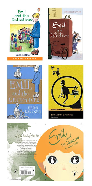
I did a google search to have a look at the range of book jackets already existing for Emil and the detectives:


A lot of the covers already existing are quite outdated as the book is almost 90 years old, consisting of very basic illustrations (most of which aren't really that exciting). 

Here are some previous winners from the same competition last year:


I have noticed that the winner and runners up have used very limited colour palettes, and have used hand rendered methods of image making; this is something that I need to take on board. The more crafted images appealed to the judges, and will appeal to the young readers too.

Factors which I will consider to make my book jacket stand out:

  • An interesting narrative
  • A striking yet appropriate colour scheme (to make the book desirable)
  • My audience: children between the ages of 8-11?
  • Appropriate layout, imagery and type
What I will do from here:(in the next week; deadline Dec 7)
  • Explorative drawing: characters, buildings etc
  • Research into the 1920's era
  • Look at potential narratives
  • Come up with three-five thumbnail sketches

Wednesday 25 November 2015

Peer review and Lino prints

Peer Review Queries

I think my printing ideas are too literal; how can I refine them
What sort of printing process shall I use?!
Peer Feedback
Do some more mono-printing; do some abstract brains
Make up brains from objects too for example the things that Oliver Sacks loved.
Try the prints and see what they look like, refine them digitally if you get stuck
Ben's Feedback
This way of working (the lino prints) is too graphic for you...
Consider making a book
Your drawings of objects and scenes from the film are really good, do some mono prints of these
Reflection

This feedback has left me feeling like I've hit yet another brick wall, and that I'm just going round and around in circles!I appreciate what people are saying but I just feel like I can't make decisions for myself. Part of the reasoning for this is that I haven't yet discovered what my real strengths are within illustration; I want to be good at everything and try new things but this just isn't possible. So at the moment I'm feeling utterly deflated, and that I don't want to continue with the project because I just keep hitting brick walls.

Results of my lino prints:

I really dislike my mono prints, I am so heavy handed with the cutting tool that they do not look delicate and aesthetically pleasing.

Things I will do from here:

Ben suggested that I 'make a shit load of mono prints' for next Tuesday. So I will go crazy and have a go at that I think. I will also look for more inspiration to keep me motivated (because my motivation is at an all time low right now!

Saturday 21 November 2015

Responsive Lecture: Narrative/ Task

Narrative in our Responsive work:


  • Our work needs to be memorable as so many people are entering these competitions: it needs to stand out and provoke reaction
  • Stories saturate our lives
  • Using narrative can enhance and underpin your creative work
Three levels of narrative:

  • Thesis- statement/theory put forward to be maintained/proved 
  • Antithesis- direct opposite comes along and there is conflict
  • Synthesis- things are resolved
The John Lewis adverts use this structure; they sell a story and not the product, this way they are so successful at promoting the brand through emotion.

Seven basic plots
  • Overcoming the monster
  • Rags to riches
  • The Quest
  • Voyage and return
  • Comedy
  • Tragedy
  • Rebirth

Task: Select a YCN/D&AD brief; Fever Tree premium natural mixers


Apply adjective: Sophisticated
Identify facts
  • The brief states that we have to design limited edition bottles to raise money for Malaria No More UK
  • The product is a premium tonic water/ mixer designed to enhance the worlds finest spirits
  • They are unrivalled in terms of quality and taste
  • The product uses all natural ingredients, no artificial sweeteners and flavourings
  • It has been voted the best selling and top trending tonic brand (drinks international 2015)
  • It is proudly poured in 8 of the worlds top 10 restaurants
  • Sold in thousands of pubs, bars, restaurants and hotels in the UK as well as most major supermarkets and independent stores across the UK.
What is the brand community?

The brand community consists of consumers that enjoy sophisticated and higher quality alcoholic drinks, and are happy to pay more than the bare minimum to enjoy the drinking experience. 

What do the facts say?

The facts say that the market for this product is hindering more towards the niche category; for over 18's that enjoy drinking high quality alcohol products. I get the impression that Fever tree want to promote the brand to more affluent customers, which reflects in their pricing against more mainstream and cheaper alternative mixers such as coca cola. 

Can you apply emotion?

I would find it difficult to apply emotion to the fever tree brand alone, although if I took into consideration the connection with the charity Malaria No More UK I could try to interpret a more emotive theme in that way.

Can you communicate facts in an engaging story which highlights values/ benefits of the brand?

Again, I would find it rather difficult to think of a story associated with the brand. I personally find that the most engaging and emotive stories used within advertising feature children, with a young, naive and charming perspective on the story being told, the same being with the narrative being focused on a family etc. However this would be a little more difficult with the alcoholic restrictions being applied

Conclusions/plans from here:

If I am to have a go at this brief I will have to do so very carefully. I know now that narrative is the most effective and emotively engaging method of tackling a brief. Although I realise that with an age-limited product that this might close a few doors with emotive opportunities. However the connection with the charity Malaria No More UK could spark an emotional engagement with the people that this charity is trying to help, which could reflect upon the brand in some way.

What I will do from here:
  • Try the drinks for myself; record the flavours taste and overall experience
  • Research competitors and the market
  • Research into the charity Malaria No More UK

Friday 20 November 2015

Responsive Issues

Problem Identification

Due to my acute struggles with the 504 module, responsive for me has worryingly taken a seat on the back burner. I am still unsure which briefs to tackle, and have still not made a start on anything.

I wanted to have a go at the Ruskin Prize, and also the Christmas card brief but due to lack of planning ahead and managing my time efficiently I have been unable to do so. This is something that I need to change pronto if I will pass this year!

Problem Solving/Organisation

I have downloaded a timetable frame so I can manage my time better on a weekly basis; making specific allowances for each module: I will also try to do this on a larger basis too so I can plan ahead in the future.


This week's timetable


Also, at home on my desk I have written out the deliverables and deadlines for each module, with a post it note of the immediate tasks I need to do underneath.


Briefs I am interested in at this stage

  • Illustration Friday (for about 10 weeks?)
  • Penguin Brief- I am unsure whether or not to do just one book or all three to make it a substantial brief
  • Royal watercolour society
  • YCN Fever tree

Soundtrack and Storyboard task

Sting example 1 http://isodesign.co.uk/projects/the-old-guys


This 20-second sting is used for the title sequence to a BBC comedy series entitled 'the Old Guys' which aired from 2009-2010. The hand-crafted paper cutouts and jazzy upbeat music attracted me to this sting.

Music: 'I'm happy' - Ivor Cutler (the lyrics say 'I'm happy (x6), and I'll punch the man who says I'm not') suggesting that each male character in the first person declares to be very headstrong in the fact that they are 'happy'.

Frame deconstruction


Clive swift looking relatively happy and content with his surroundings; a well furnished home and a lady, until the giant hands start to grab and remove his belongings.


Facial expressions change to outraged as his belongings have all been taken away, and a random suitcase is plonked next to him.

(the theme tune of 'I'm happy' is starting to take an ironic note)


Roger Lloyd pack is in a similar position, he is happily surrounded by happy punters at a busy bar...


...When everything is removed from his surroundings too, and he is also given a random suitcase.


Lloyd- Pack and Swift meeting for the first time with their suitcases, not looking too amused about the situation.


What seems to be a very uncomfortable car journey...


The pair being placed in a living room, propped awkwardly next to each other on a small sofa. Two younger women appear; an indication to the audience that Clive and Lloyd-Pack will interact with these women during the series.


The end sequence, showing the gentlemen outside their new shared house with their arms round each other and a sun shining above their heads. This suggests that although the first impressions of each other were not great, they may in fact befriend each other in the duration of the series.

I have noticed that this sting is very 'busy' and quick paced, in effect that something, somewhere in the frame changes with every beat of the music, although the changes are not strictly rhythmic and robotic, so each frame flows more smoothly. I also thought the choice of music was very fitting to the generation and target audience of the show. Using a jazz piece from the 60's will be familiar to the older generation, as well as the two main characters being in their sixties and seventies.

In terms of my own sting, I will take on board the importance of music choice, and how to vary the complexity of the narrative. A sting of this level has required a much higher level of craft to what I'll be using in terms of having Lloyd-Pack and Swift live acting in the frames.

I will need to do some research into my desired target audience and consider what kind of music will associate both with them and with Oliver Sacks, and what will be the extent of the narrative sequence?

Sting example 2 https://vimeo.com/16093039


The second sting I chose was one entitled 'popcorn', made for the annual E4 sting competition. I was interested in the forms of key movement used, as well as the calm acoustic style music; as I am considering using this type of music in my own sting.

Frame deconstruction


Opening scene pans down to field with slow guitar chords playing.


The frame begins to shake as the popcorn is brewing, zooming into the corn cobs in the field. Sound effects become louder than the music.

This continues as the corn continues to brew more rapidly.


The popcorn explodes (with sound effects) and fills the frame, very close up.


A wintery popcorn scene begins to emerge, the musical layers build up by adding little piano trills to accompany the guitar.

The scene continues to pan out and gradually fades.

More than the first sting, I can see my sting being composed and constructed similar to this one in terms of musical similarities, use of sound effects and the number of events happening, which is a small number in comparison with 'the Old guys' sting. Obviously my sting will be lower in complexity in terms of movement, but I can take this sting, and others that I watch and take note of the use of key movements and how that intertwines with both the sound track and the narrative.


Further Research- Soundtrack and Content

I am really struggling for ideas for my sting. I had a look at the third years blogs from this time last year to gain an insight into the processes and final outcomes that they produced, which was helpful because it gave me a vision to work towards. I also tapped in 'Oliver Sacks' into vimeo and found a few animations relating to him and his work.


This animation is in a trailer format of one of the patients from 'the man who mistook his wife for a hat'; The Lost Mariner. The content of the animation is just right, although the animation complexity would be a bit of a long shot for me to try and replicate.


'Myron and Hester is a love story animation inspired by Sacks' book Awakenings; it doesn't advertise a documentary about Sacks in terms of context but I am drawn to the use of simple movement and the piano soundtrack that is used in the sting.

Ideas at this stage:

  • Piano/acoustic music
  • Documentary about prosopagnosia; because sacks suffered with that himself
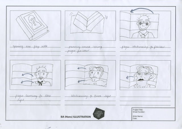
Storyboards

Concept One: 

 
Based on the initial ideas of my prints showing the processes in the brain of the struggles of Sacks' prosopagnosia (the ability to recognise faces)

Concept Two:


A metaphor for prospagnosia; the identity flipbook. Each page turns and gradually reveals Sacks' face, then the book dissolves and only his distinctive features are left, his glasses and his beard to represent how face blind sufferers pick out particular features in order to recognise people.

Concept Three:


I put a little more thought into this storyboard; I set the scenario of a surprise birthday party for Sacks', an atmosphere surrounded by his closest friends and family. For any person this would be a surpise, but for prosopagnosia sufferers, it would be a challenge to recognise each face in front of you, even the people who are closest to you, 

I am really keen on this third concept and I plan to take it further. For the after effects workshop on Monday I will prepare the appropriate images and find the following sound files:
  • Footsteps leading up to a door
  • A door opening
  • A lightswitch turning on
  • Piano music