Wednesday 29 April 2015

OUIL406 Visual Communication End of Module Evaluation

1. What skills have you learnt through this module and how effectively do you think you are employing them within your own practice?

In this module I have learnt how to make an animated GIF, and the basic principles of animation with looping a continuously moving image. I have also learnt how to use vectors as opposed to pixels, creating images by using flat shapes. Both have been extremely informative, interesting and enjoyable and have allowed me to become more confident and enthusiastic about using digital media in my work. I even chose to use vectors in the final brief, Persons of Note, because I enjoyed them so much and wanted to challenge myself further.

2. What approaches to/methods of image making have you developed and how have they informed your concept development process?

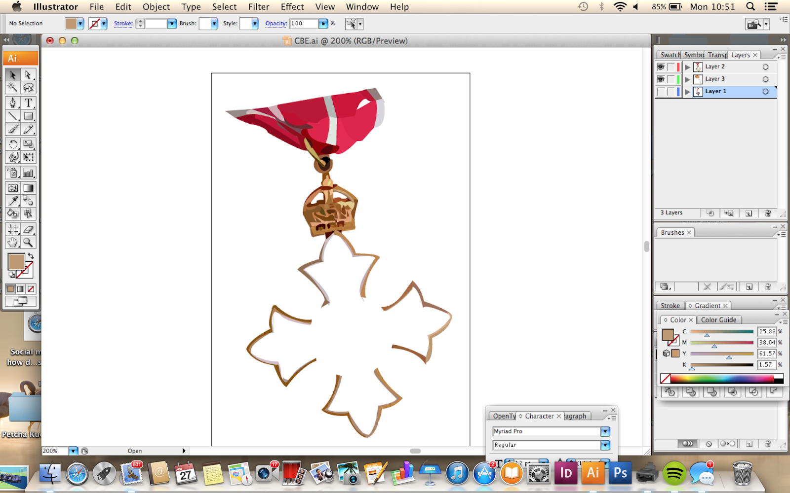
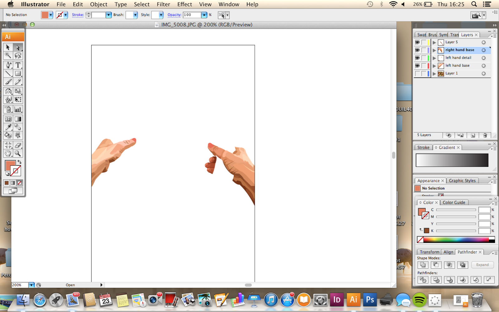
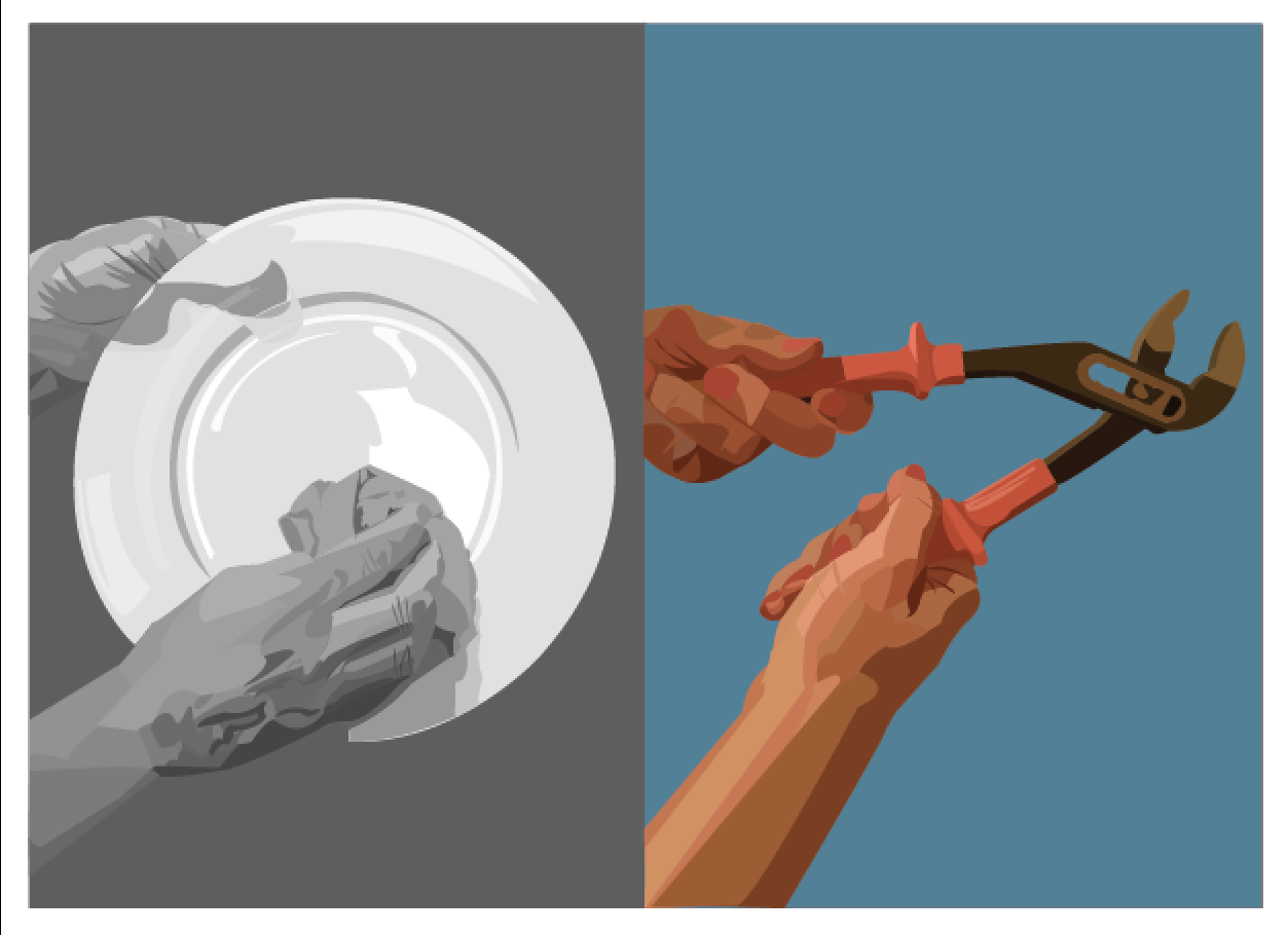
Digital image making has allowed me to create more perfected and professional outcomes, as opposed to hand rendered methods which can sometimes look a little less professional when the emphasis is on communication. With the aid of Photoshop and Illustrator, I have had the confidence to push my initial thoughts and concepts further. In 'I See Faces' I took my character drawings and by animating them in light hearted and humorous scenarios. In 'Greetings From', I filtered my knowledge of four different cities into specific themes and created compositions of recognisable elements to communicate to the viewer where the postcard was from with the use of flat shape created by vectors. Finally I continued to use vectors in 'Persons of Note' to inform my audience about the life of Amy Johnson in a more sophisticated way by exploring the treatment and attitudes of women in the 1930's, the appreciation of flying and the progression of Johnson's solo flights.

3. What strengths can you identify in your work and how have/will you capitalise on these?

I feel as if my main strengths are that my finished outcomes are very expressive in different ways. Throughout the production process I would always say to myself 'what do I want to communicate to my audience?' and allowed my work to develop in a way that would portray a really clear message and amplify the facts, feelings and information I wanted to get across. 
Being thrown in at the deep end having to learn and adapt to using Illustrator, and also learning to animate still images in a short space of time has pushed me to be more ambitious by embracing digital techniques as opposed to shying away from them, staying in my usual hand rendered comfort zone. Choosing to use Illustrator in Persons of Note was a big step for me, as I would't usually put that  sort of pressure on myself to produced finished work in a programme that I wasn't 100% confident with. However I am really pleased in what I achieved with my outcomes in that brief, and will continue to challenge myself in future briefs by throwing myself out of my comfort zone more often.

4. What weaknesses can you identify in your work and how will you address these in the future?

In general, I need to stop being so cautious when experimenting. I know full well that I don't do enough drawing for pleasure, and also in briefs because I am to much of a perfectionist, and am too impatient to finish my work on time. I must allow myself time to completely focus and exhaustively produce drawings based on my initial stimuli, and not being afraid to experiment with a range of different media. This is something that I always manage to fall short on, which leaves me less options when choosing the most effective form of media that will produce the best illustrations to communicate my message clearly. I have found using a large timetable really effective in terms of planning ahead long term, and tick-lists for every day short term tasks to complete. In the future I will definitely emphasise the importance of media testing on timetables and tick lists, hopefully resulting in the broadening of my developmental skills.

5. Identify five things that you will do differently next time and what do you expect to gain from doing these?


  • Be even more speculative at the start of each brief. Take books out of the library, search the internet, look for any local work or exhibitions that will help me get off to a good start by being inspired.
  • CALM DOWN, stop being so impatient and panicking about finishing on time. Allow more time for 'down time' so I don't burn out so quickly and feel exhausted.
  • Continue to use a timetable and every day tick lists to manage competing tasks more efficiently and having manageable goals to work towards.
  • Keep setting myself challenges to step outside my comfort zone by using methods and processes I am unfamiliar with. This way I will broaden my illustrative skills and knowledge.
  • Make time to media test and enjoy drawing freely in relation to the subject matter. This will allow me to have more options when choosing a method to work in, and also develop my expressive understanding of the brief.


6.How would you grade yourself on the following areas: 
(please indicate using an ‘x’)  

5= excellent, 4 = very good, 3 = good, 2 = average, 1 = poor

Attendance-5
Punctuality-5
Motivation-4
Commitment-3
Quality of Work Produced-4
Quantity of Work Produced-3
Commitment to the Group-4


Tuesday 28 April 2015

Persons of Note Final Evaluation

Skills and Development

In this brief I have continued to use Adobe Illustrator to produce my finished pieces, and I personally think my skills using the programme have noticeably developed to a higher standard. Working from photographs and my own sketches has allowed me to make my work more personal and sophisticated, as opposed to solely tracing secondary images found on the internet.
This has allowed me to grow in confidence when using Illustrator and result in my finished outcomes being of a higher quality.

Difficulties and Setbacks

I faced a few difficulties in the motivational side of completing the postcards, purely because they required a high level of attention to detail, and a lot of patience(something that I need to work on!)
I found having the brief extending over the Easter break a bit of a setback, similar to the way that I struggled with Visual Narratives being over the Christmas break. For me it is more difficult to discipline myself with other commitments I have at home, and find time to concentrate fully on my work. Also, just the different environment altogether being away from the city I study in and my peers in the studio, releases the pressure a bit for me. I have found that I work better with a little bit of pressure (not too much) for time, so that my full attention is focused on my work.

Things I would change about my work

I really wish I would have spent more time media testing. I am really kicking myself at this stage because I say this in every single brief! Although I am pleased that I chose to use vectors because I enjoyed them so much in the last brief, I didn't allow myself the full option of other possible media I could have used, that could have been equally as successful.
I have noticed that my problem is that in the early stages of a brief I get really frustrated that everything is at loose ends and that the direction that my work is going in is unclear. This means I have a tendency to just go with the first idea I come up with, rather than completely exhausting every option possible, having a restricting impact on my development processes.

What have I gained from this brief?

In all honesty, at the beginning stages of this brief I felt quite unmotivated because this project was really similar to something that I did at A-Level two years ago, and I feel like I have progressed a lot since then. However the difference from then and now is that with the help of group crits, I have been able to look deeper into the meaning of my person of note, Amy Johnson, and express how I feel about her in my work by using fact, language and symbolism. 
I look back and think that I maybe could have pushed my ideas further and tackled things with a more light-hearted, humorous feel but I am pleased that I have approached the subject in a more sensitive and sophisticated way, especially in my comparative postcards. I hope that introducing the issue of the suppressed lives of women in the 1930's in comparison to Johnson's short but exciting and ambitious lifestyle will have an emotive impact on the audience by using hands and colours as main forms of symbolism. The same way that the maps in the stamps will be informative about the progressions of her courageous solo flights, and that the use of powerful, one word language will capture the essence and feeling that flying brings in the poster.

Reflection on Organisational Skills

Key Transferrable Skills

At the end of every brief I always say that'I wish I would have been more structured and organised'.
During the last couple of months, with pressure on other modules I found it a lot more refreshing to stick to a timetable. Not a completely strict one, but just so that I could plan my time efficiently.

I had difficulty planning when to do work in the Easter break with having to work a lot of hours at my job back home, but as soon as I was back in Leeds and had the pressure of deadlines, I was a lot more focused.


I also made a lot better use of my notebook during this brief, making tick lists for each day and crossing things off as I went along. This made me realise what my priorities were, and with each line through a task I had completed, I felt a big sense of achievement.


Being more organised has allowed me to complete my work on time to a standard that I am happy with, as opposed to rushing at the last minute and not fulfilling my potential.

Monday 27 April 2015

Finishing Touches and Final Outcomes

Visual Quality

About an hour before my print slot, I had a chat with my tutor to see if any of my work needed amending. I just needed to make a few tweaks:


  • Change the colours on the poster to fit in with the theme of the stamps and postcards
  • Edit the silhouette of the mountain so that it doesn't look as if it has been 'live traced', also add a mountain in the foreground to add depth to the image
  • Make a proper dashed line, instead of a haphazard dashed line for the stamps
  • Edit the thickness of the lines in the stamps
(I didn't take any screen shots of the editing process because I was under pressure to complete them in time!)

The Printed Outcomes


Reflection

The poster, postcards and stamps have all printed out relatively well, with a minor error of printing stripes if you look closely. Apart from that, I am pleased with the way the colours work with one another making them work well altogether in a set, which is something that I have struggled with before.

I am glad that I made the last minute finishing touches to increase the visual quality of each format, I definitely know that if I would have left them as they were, at this stage I would be thinking'I wish I would have done this differently'.

Third Postcard Development


Intentions

The third postcard has the most striking message of the three; choosing a career and achievement over motherhood. Most women, even today see becoming a mother to a child as one of life's most precious aspects, which isn't a bad thing at all, but this completely contrasts with Amy Johnson's views.

Holding a CBE medal in the same way that a mother would hold a baby symbolises the fact that Johnson strived off achievement, setting targets for herself, breaking records and gaining rewards.

Practical Skills and Development

Perhaps because this is the most sensitive and delicate of the three postcards, it took a lot longer than the others. However this could be because in the time I have spent drawing hands on Illustrator, my skills have noticeable improved from the first postcards with regards to attention to detail.


Difficulties

I did have a hard time trying to complete this postcard because I felt exhausted from staring at the screen for so long and having to concentrate on each segment of the hand with full attention to gain the best visual outcome.

I also kept asking myself, 'is using Illustrator cheating in a way, as I am just tracing a photograph?' However I was pleased with the outcome of the first two postcards, and this kept me going to complete it.

The worry did arise that I haven't done enough media testing, and just used Illustrator as an easy way out. Yes I probably should have done a few more media tests to broaden my practical development on the subject, but as I have learnt by drawing out these postcards, Illustrator takes a lot of time and patience!


The baby took quite a while to complete, as I wanted it to look real and less like a plastic doll! To help this, instead of drawing his/her eyes open, I closed them to make the image seem more delicate as opposed to having a creepy-looking baby staring into the viewers eyes, and distorting the meaning.


Here, I encountered a similar problem to before, with the photograph not being long enough to fit in the frame on the final image, therefore I had to do some guess work and figure out where the baby's clothes would crease, using the appropriate shades of grey.


 I didn't take many screenshots whilst completing the last pair of hands as at the time I felt like I was losing the will to live! However I am so pleased with their outcome, without sounding big headed, I think they look very realistic from a distance.


Visual Quality

At this stage in producing the postcards, I think that the more time and practice taken out on drawing out the hands, the more visually pleasing they look.

Comparing my first and latest postcards there is a huge difference in visual quality which has come with the development of my skills using adobe Illustrator.

The Final Part

I produced the CBE on the morning of my print slot which I felt was a bit risky, but I had to get on with it. In hindsight, I wish I would have drawn out the medal by hand and traced it, rather than tracing a secondary image. Also, the outcome looks a little rushed and not as detailed as it could have been, but at this stage the most important thing was to finish everything ready for my print slot.


The Final Third Postcard

Reflection

I am actually really pleased with the outcome of the last postcard. I feel that I have fulfilled my intentions to include symbolism in a sensitive way and I'm glad that the time I have spent into crafting the hands in a digital way (something that I wouldn't have even thought about doing a few months back) has paid off with a good standard of visual quality.

Friday 24 April 2015

Persons of Note- Second Postcard Development

I was feeling the pressure to complete each pair of hands for the postcards with the long length of time it is taking to draw them out on illustrator, and my print slot being on Monday.


Practical Development

I found it really interesting to draw textures using Illustrator, as I haven't really done it before. I was pleased as to how the wool turned out by using different tones; although in future development I would like to have a go at incorporating actual textures into the flat shapes that illustrator creates.


Continuing to trace the second pair of hands


Difficulties

I had a few issues with drawing out the wheel; it looked pretty lop-sided due to the position of the frisbee that I was tracing. In hindsight, I could have chosen some thing less hap-hazard for my mum to position her hands on, perhaps a real steering wheel.


Visual Quality

I did have a bit of a battle trying to make the wheel look more circular after I had composed the final image, however at this stage I had flattened all of the layers by mistake which didn't allow me to make the hands the top layer.
I tried pasting the shapes of the hands over the new more spherical part of the wheel, but I just wasn't getting anywhere with it, so I decided to leave it to save time.


The Final Second Postcard

Reflection

I am pleased with the composition element of the second postcard, however that wheel is bothering me. At a later stage I may go back and try again to make it look more spherical, but from a different perspective, I feel as if it has a little element of charm with it being slightly off-perfection. 

As of now, with only three days left until I print my poster, stamps and postcards, I need to put all of my energy into completing the final postcard before I go back and make any amendments.

Wednesday 22 April 2015

Kate Beaton Artist Reference

'Katherine Sui Fun Cheung'
During the COP Pecha Kucha presentations today, this image appeared on one of my peers' slides, which had a strong connection with project about Amy Johnson.

Kate Beaton took a degree in history, which is now the main subject in her illustrative career. This piece about Chinese-American aviator, Katherine Sui Fun Cheung. Similar to Johnson, she had a strong drive for adventure and achievement; she was the first Chinese-American woman to receive a commercial flying licence in the United States.

Although I am not presenting my work in a comic strip format or using language within my images, I was inspired by the way that Beaton captured Katherine Sui Fun Cheung's gutsy attitude in a humorous manner with the interaction with other characters, and exaggeration and emphasis on the dominant character herself.

In comparison to my work, I have taken a more sensitive and sophisticated approach to the attitudes of women in the early 20th century, whereas Beaton's approach is more playful and flamboyant in her style of drawing and language used. 

Tuesday 21 April 2015

Persons of Note- Postcard Further Development

With the stamps and poster completed to a suitable standard, I have allowed myself to spend a considerable amount of time completing the postcards.

Intentions

From my last crit, I decided to focus more on the symbolism of these pieces, in particular focusing in on the meaning of hands and of the colours I choose to use.

I have produced some more developed rough sketches as to how I'd like my postcards to look, this time with each pair of hands being in similar positions in order to amplify the meaning.


Practical Skills

I took some photographs of my mums hands in appropriate positions to draw for my postcards. This way, I wouldn't feel as though I was just simply copying another image when using illustrator.


The First Postcard

Intentions

I decided to convert the colour of the first image (of normal every day women) to black and white. This represents the fact that most women in the 1930's lived in a sexist society where they were undervalued, in a dampened lifestyle without having prospects for a bright future.


Practical Skills 

Using Illustrator, I selected different sections of the hands using the picker tool and drew out each shape appropriately, I soon realised that this was an extremely lengthy process and would take a lot of care and patience.

I found it easier to use a wacom tablet in this process to select each anchor point more quickly and accurately. 


From tracing photographs, I was more prone to leaving gaps in between shapes which was frustrating, but easily amendable by using the direct select tool and filling in the blank spaces.


Problem Analysis

One of my peers suggested that I could maybe reflect the position of the hands on the postcard so that it gives a more symmetrical effect. However after testing using the outline of the second image in relation to the first, I decided to stick with my original layout. Having it reflected brings the line of sight towards the centre line of the postcard, rather than allowing the viewer to see the comparisons and similarities between the two images.


Again, the tracing of the photograph was quite a lengthy process but I managed to complete it to a good standard.


Problem Analysis

When it came to arranging all of the elements onto my postcard, I realised that the right hand in the second pair was too short for the image, giving the impression that it was floating in air.

Problem Solving

To amend this issue, I used the direct select tool and extended the end anchor points down to the bottom of the border.


Colour Symbolism

When it came to choosing a background colour, it was important that I took the meaning of colour into consideration.
My options were either:

  • Red- Symbolising bravery, courage, danger and excitement
  • Blue- Symbolising stability, leadership, strength and truth


Although red would have been the most appropriate background colour to use, it seemed to clash a little with the skin tone. The blue was more complimentary to the skin tone, but the red symbolism is still visible with the handles of the wrench.

The Final First Postcard

Reflection

The outcome looks exactly as I hoped it would thankfully, I am pleased with the position of the hands, how they look having used vectors and the overall message that the image communicates.
I will continue this colour theme in my next two postcards, having one element in the coloured photo being red, representing everything that Amy Johnson stood and acted for.