Good composition can achieve producing a harmonious image and give the viewer a satisfied sense of beauty.
The four main elements of composition are:
- Picture area- the flat surface within the four borders of the picture. Chief concerns are how big you make your objects and where you place them.
- Depth- the illusion of distance or a third dimension, making things exist in space.
- Line- the outline which encloses a shape and the line of direction our eye follows in looking at a picture.
- Value- the lightness or darkness of a particular area or shape within the whole picture.
The first thing to do when thinking about composition is to plan or visualise the idea firstly in your head, starting with a clear idea that can easily be put down onto paper.
Examples of illustrators thinking about composition in the development of their work:
Josh Cochran
Lorraine Fox
Breaking down images into shape, line and space:
Victo Ngai
Lots going on in this image, both within the foreground middleground and background. The colour scheme is very specific and the use of colour is balanced. Many of the objects overlap due to the mass of information in the image.
Michael Kirkham
The image displays clear use of perspective and most of the detail and colour is focused in the middleground of the image.
Glyn Dillon
The eye is immediately drawn to the bold red tones within the larger image. The darker tones and shadows and direction of light give the image a greater sense of depth.
Luke Pearson
The colours in the background of the image applied to the many busy characters, are minimal variational tones based on one shade. This contrasts with the larger more intricate character in the foreground of the image, which centers the viewpoint due to the contrasting colours.
Serena Katt
Using rule of thirds within the image balances out the composition evenly. The line of sight is horizontal due to the layout of the elements.
Tomer Hanuka
The bright colours used in the background contrast with the dullness of the characters used in the image. The angles of the stairs against the yellow bricks create an accurate line of sight and a sharper sense of perspective.
Eleni Kalorkoti
The image is evenly balanced out within two halves; the large portrayal of the girl against the buildings, making them appear to look small and surreal. The overlapping of the houses and buildings makes the image appear buisier.
Eleanor Davies
The majority of this image is taken up by the lady cleaning in foreground which works well with a landscape canvas. The smaller lady in the background and the leading lines of the pictures on the walls create an accurate perspective.
Joe Todd Stanton
The image appears to be quite flat due to the focus being on the contents of the chalkboard, in which the image is mostly focused around. The figure in the centre of the image balances the colour out and gives the image a sense of narrative.
Robert Heindel
At first the colours seem extremely harsh on the eye due to their brightness in value, however the figure in blue adds a sense of balance to the image. The overlapping of objects and the leading lines on the ceiling create depth and perspective.
Task and Aims
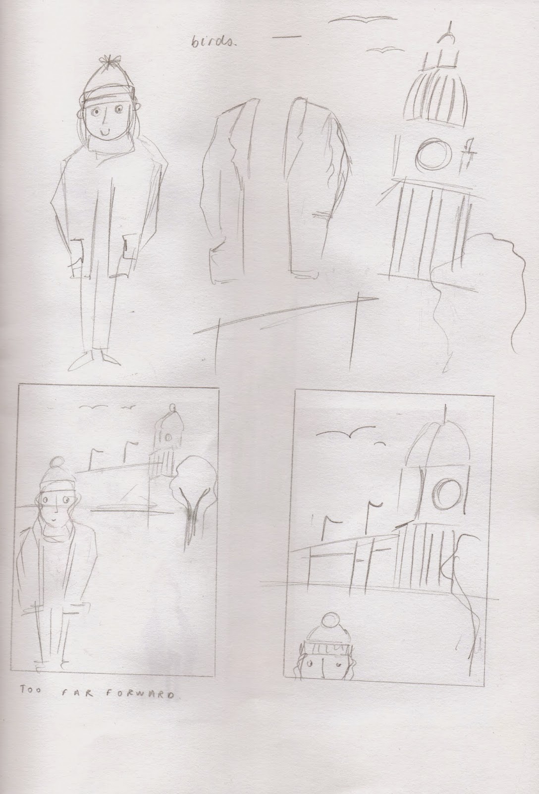
3 Elements challenge, Design 5 compositional sketches of the same 3 elements:
Other Attempts:
Reflection
Evaluation
3 Elements challenge, Design 5 compositional sketches of the same 3 elements:
- Figure
- Object
- Landscape
Intentions
To become more aware of how to arrange elements correctly to create a well structured image.
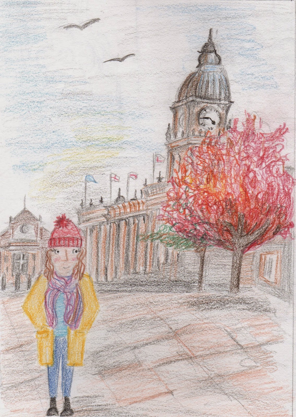
I wasn't able to attend the initial briefing session, and from my own interpretation I accidentally misinterpreted the brief in thinking we had to create roughs for EACH element, rather than just a set that included the three. However subconsciously I managed to produce one finished piece that did include all three elements.
Work Made
My favourite, most approriate and most successful response to the brief
Other Attempts:
Composition is definitely something that I struggle with. This task has enabled me to gain a better understanding of the value of elements within the frame, their positioning and how they work with perspective.
Evaluation
I did struggle with perspective, especially in the image with buildings, attempting to emphasise the line of sight and making everything fit correctly into proportion. However completing the task (accidentally three times)has allowed me to develop a better understanding of the importance and value composition has within an image, and how the more accurately composed they are the more appealing they will be upon the viewer.


No comments:
Post a Comment