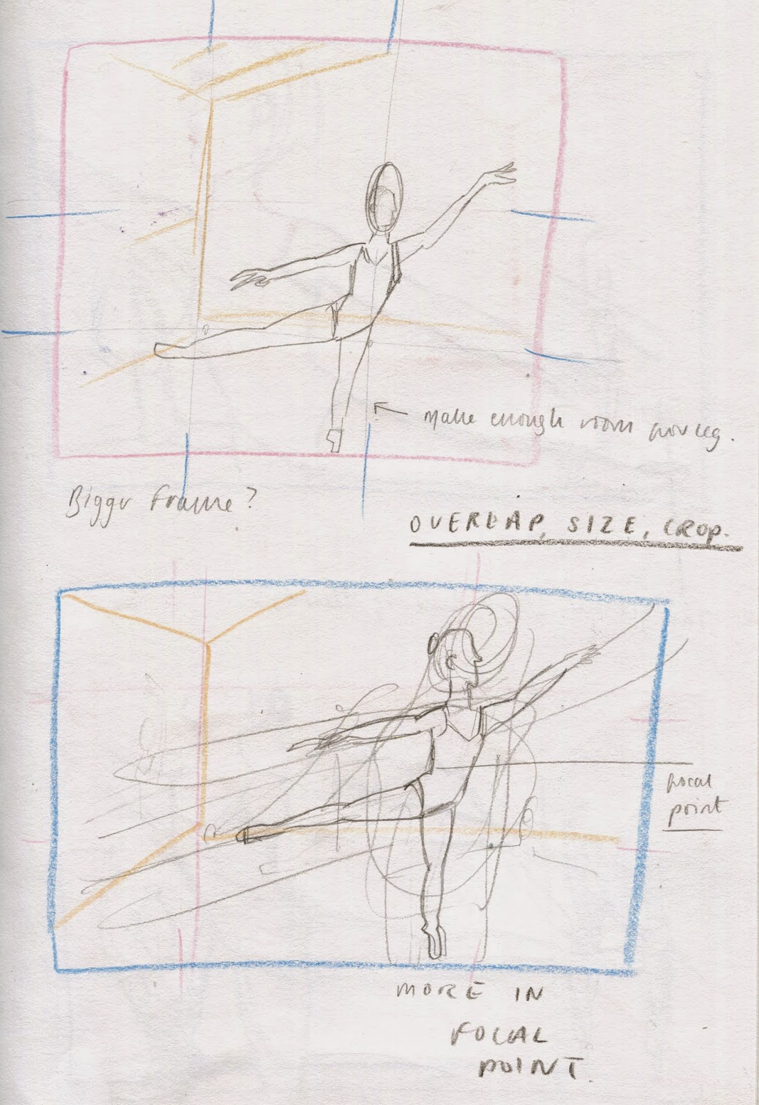
This can be achieved by overlapping elements within the frame and also drawing objects smaller as they get further away from the eye.
Viewpoint is the way or angle that you see the scene from. It can provide you with a different perspective of things, and altering it can create a more interesting arrangement.
Critical Task- Deconstructing images focusing on the following composition considerations:
- Depth and how it is created
- Arrangement and overlapping of objects
- Use of foreground, midground and background
- Points of perspective
- Viewpoint
- Composition
Laura Harwood
Court line is slightly off-centre leading the eye back to the top of the picture. The horizon line is strange.
Laura Carlin
Good leading lines and vanishing point. Darker middle panel of ceiling creates depth. Perspective is a little off- windows uneven ceiling too high.
Yan Kebbi
Viewpoint is skewed and odd- we can see both up and down. Darker bolder shapes create depth, also with overlapping. The transparent buildings allow us to work out how big things are.
Sophia Foster-Dominio
3-D illusion of the room, dark wall and stairs deepen the room. All objects are of a similar size but are lined up on on the same axis of 45 degrees.
Miroslav Sasek
Leading lines, perspective, overlapping of people creates good perspective- reducing information down as it gets further away. Circles and curves make harmony.
Michael Gillette
Approaching a birds eye view. Reflections bring in more depth.
Laura Carlin
Statues appear dimmer the further away they go, the contrast in colour helps too with the main focal point being of the brightest shade of white.
Sean Tan
Eye follows the fish, these are white and everything else is grey giving greater contrast. The people are looking up at the birds reinforcing the suggestion that they are the main focal point.
Mobius
Overlapping of the rocks and the water, bird cuts across the page and breaks the picture up. Rocks and water staggered backwards drawing the eye to the back of the image.
Practical Task and Aims
Devise a piece including Three Figures which must have a sense of depth. Using pencil crayons.
Devise a piece including Three Figures which must have a sense of depth. Using pencil crayons.
Initial thoughts- 'A sea-life selfie'
I instantly thought that this was a terrible idea. It also wouldn't be challenging enough.
Intentions
More challenging idea: BALLET CLASS. Incorporates figure (which I need to practice), depth, perspective and most things we have learned so far. Challenge accepted!
Work Made
I struggled with the arrangement, and it took me a while to adjust the figures to achieve the correct proportion, especially as ballerinas are such a delicate subject matter.
The Final Image:
Evaluation
It was difficult to enlarge the image onto an A3 sheet and keep the same proportions as I had done in my roughs. I also hadn't incorporated using colour pencils within my roughs so I found that I was thrown in the deep end in terms of use of colour and technique.
However I found this task extremely useful, and very challenging. Having so many criteria to fill to do with the placement and efficiency of each element within the frame, I paid greater attention to the relationships and sizing of them in order to portray the scene clearly- a ballet class. My understanding of depth has been increased significantly by studying the line of sight and perspective in more detail to achieve an accurate viewpoint, and an image that works well.


No comments:
Post a Comment