Knowledge and Understanding
Elements I considered including:
- Original Marks and Spencer
- Leeds Owl
- Beer Festival
- Corn Exchange
- Leigh Francis (Keith Lemon)
- Tour De France
- Kirkstall Abbey
- Students!
Problem Analysis
Leaving myself only two days to complete this postcard before the deadline, I was feeling the pressure, which was good in a way because it increased my motivation significantly. However my niggling kryptonite (composition) came back to haunt me yet again.
Problem Solving
I've learnt from producing the last few postcards that you can't include everything you hope to within the postcard because it won't make sense. The main thing is that I include the Leeds owl, because my theme is based upon animals engaging in scenarios within the City.
I chose to include:
- Skyline (showing the Leeds University Parkinson building particularly to represent student life- merely because it is a distinctive building-no rivalry/bias intended)
- The Corn Exchange- because it is a beautiful, unique and distinctive building
- The Leeds owl engaging in stereotypical student activities (drinking on a hangover with a graduation cap)
- Tour de France- bit hit and miss but I decided to challenge myself.
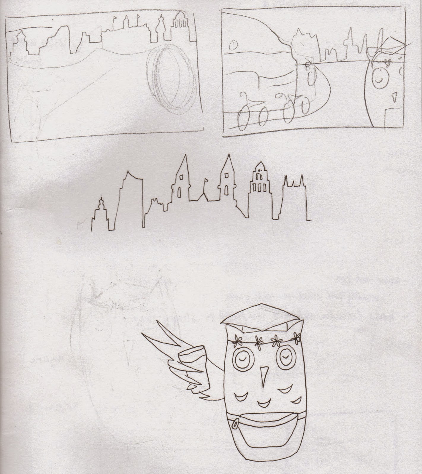
This time I really tried hard to invest what time I had left in re-developing my roughs, so I could just crack on without wasting time re-arranging elements.
Skyline
The Corn Exchange
Difficulties
This was hands down the hardest thing I've ever traced in my whole three weeks of using Illustrator. But I somehow managed it! I used layers for each section, which I found really tricky in the lower section with all of the windows when wanting to create tone and shading in the darker and lighter sections.
Practical Development
Remembering to use layers effectively by naming them made the process so much easier to see which section I was working on, especially with a complex shape like this.
I decreased the opacity of the base layer (brick) when adding detail to the windows, which took an unbelievable amount of patience.
I shuffled the skyline along to the right, to remove the gap and so that the most important buildings would be visible.
Self Reflection
I actually feel incredibly lazy that I didn't take any photographs of Leeds myself, and almost feel as if I've cheated by tracing that image of the corn exchange. That may have been a suitable option if I had been more organised in the first place, but at least I have incorporated some of my own drawings into this composition (owl and skyline).
Student Owl
The student owl has a connection with Leeds Festival with its bumbag, floral headband and beer in hand. The graduation cap represents the vast number of students situated in Leeds, and its closed eyes symbolise many sleepless nights/hangovers.
Practical Development
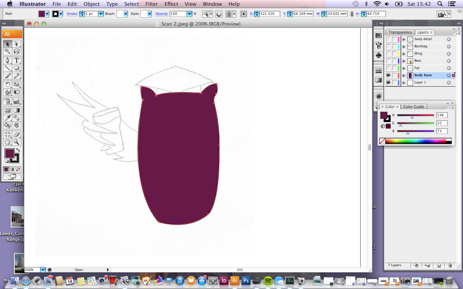
Since experiencing qualms with layers in the previous postcards, I have eased myself into the habit of using multiple layers, and naming them accordingly; in this instance I had separate layers for the body, hat, eyes etc.
This has helped me become more organised and efficient in the editorial process.
The daisy headband didn't look as great as I thought it would.
As a finishing tough I decided to add dark semicircles under the owls eyes, to emphasise lack of sleep within students.
I only did a minor bit of shuffling around, so that the elements overlapped in the most appropriate way to create depth.
I then added windows to the skyline to make it appear more visually interesting as opposed to a bit of a boring shape.
Tour De France Cyclists
Spokes didn't look great.
Visual Quality
I spent a little longer than expected tracing the shape of Bradley Wiggins, but I am really pleased at the way it has turned out; a little bit of patience goes a long way (something I need to take on board) although for upcoming cyclists I will definitely simplify the complexity of shapes.
The simple shaped cyclist still looks aesthetically pleasing.
In my state of bike tracing related fatigue (slight laziness), I decided to rearrange the owls arm so that it would cover the horizon line (so that I didn't have to draw any more bikes), but on the other hand I think three is a suitable number of bikes without drawing too much attention away from the other elements in the image.
The Finished Image
I am so pleased with the way that the Leeds postcard has turned out, and without being biased because I live here, it is my favourite from the set I have produced. Considering the amount I struggled decided what to include in the image without over-complicating the concept, I think it communicates clearly with a good balance of elements which represents the charming character of Leeds.
Composition
Thirds
The image is relatively well balanced, especially the owl being situated in four accurate squares, although I possibly could have used the four centre points more accurately.
Line of Sight
The line of sight is quite complicated in this image because there is a lot going on. The eye is immediately drawn to the white head of froth on the beer because it stands out against the dark shade of purple of the owl. It is then drawn diagonally towards the cyclists, back to the owl, along his arm and into the background. I see this as a sense of achieving depth due to the many paths that the eye has to take.
Key Transferrable Skills
My organisational skills were not entirely on point towards the end of this brief in general, if I had used my time more wisely I could have gone out and taken photos of specific elements in Leeds as opposed to sourcing them second hand; it would have made my work feel more original.
On the other hand, I am really pleased with this postcard. It is a reflection of what I have learnt during this brief with successes and struggles, and shows that I can work well under pressure (I completed this in a day!)
I think that this is the most clearly communicated image, that isn't too generic. Each element represents a different area of character within the city and is arranged effectively to create a sense of depth.


No comments:
Post a Comment