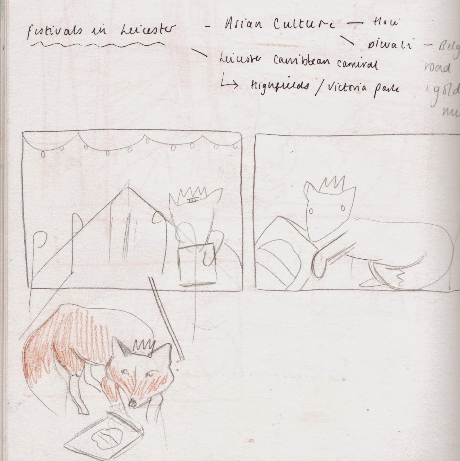
I thought Leicester had a lot of potential for interesting elements:
- Leicester Fox
- Walkers crisps
- Discovery of Richard the Third in a car park
- Red Leicester Cheese
- Woolen Socks
- National Space Centre
- Old John- Bradgate Park
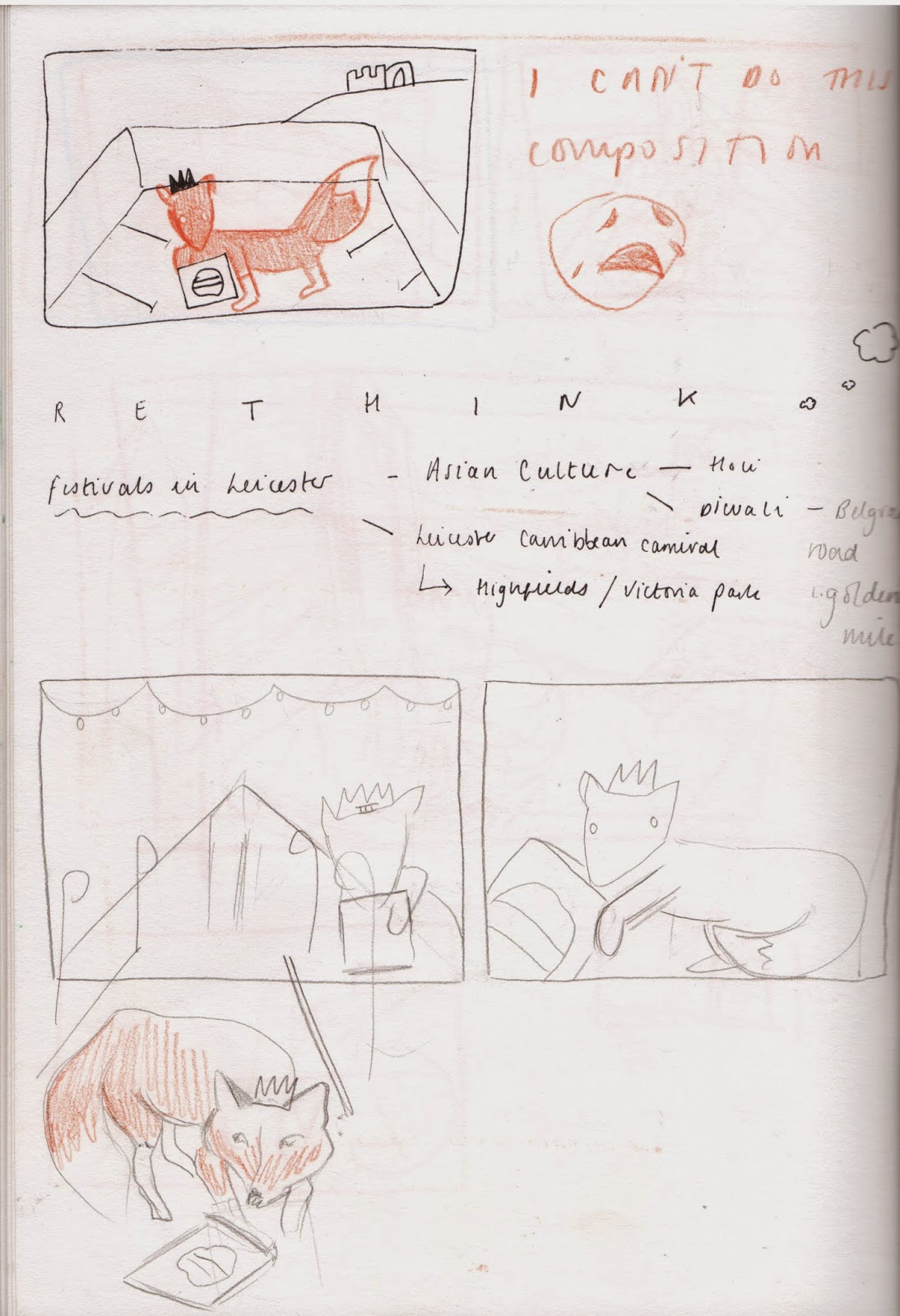
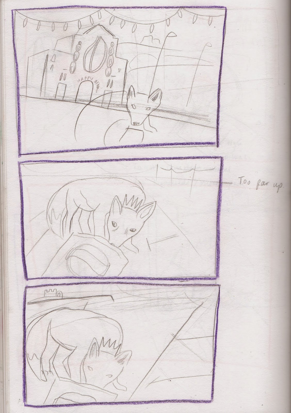
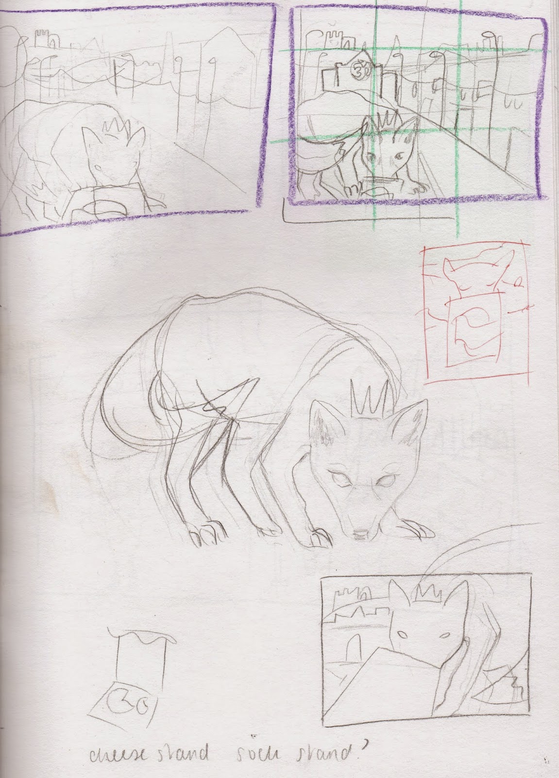
Rough Sketches (many of them)
Conceptual Development
When I considered changing all of the postcards themes to festivals, with the animals intertwined.
Considering incorporating Diwali into the postcard, due to Leicester's large asian population.
Problem Analysis
I was having a really bad time with my roughs for Leicester, I just couldn't seem to arrive at a good composition, which made me rush them more, becoming increasingly impatient.
This was around the same time that my tutor told me to simplify things, so I decided to remove the festival element from the concept and just focus on the things that I thought represented Leicester the most.
- Fox
- Richard the Third
- Walkers Crisps
- National Space Centre
- Old John
Due to lack of time, I rushed straight into designing on the computer (which I majorly regret). I should have taken maybe half an hour to chill out and just do a bit of drawing in relation to the image that I hoped to produce.
Designing on screen is bad!
Leicester Fox
Do I add car park lines to symbolise the place where Richard the Third was found?
Crisp Packet
I invested a lot of time into the crafting of the biggest, most important and distinctive elements to do with Leicester. This included adding the crinkles and light reflection to the crisp packet, and individual hairs to the fox.
Testing out background colours
National Space Centre
Composition- my biggest setback
Too much empty space between elements
Too little space between elements
I feel that this composition is relatively balanced, but I felt the need to experiment with a skyline to give the image a greater sense of depth.
I am much happier with this version of the composition; everything looks more balanced with a greater sense of depth, which is helped by the overlapping of objects and appropriate sizing of the most important elements.
Richard the Third's Crown
The Finished Image
Practical Development/Visual Quality
I am pleased with the outcome of the Leicester postcard, especially with the amount of difficulty that I experienced with the rough sketches and composition. I think investing more time and patience paying attention to the intricacy of each element has made the image more aesthetically pleasing, as well as creating a more vivid sense of third dimension.
Composition
Thirds
Much similar to Bristol, the composition isn't strictly abided to the rule of thirds, but is well balanced (considering I basically designed it on screen...) The two main elements take up a comfortable proportion of two thirds, and the two background elements sit comfortably in between, overlapping which gives the image a greater sense of depth.Line of Sight
The eye is drawn straight to the crisp packet,(I'm hoping the viewers will think 'Walkers Crisps-Gary Lineker-Leicester!)then to the fox, and back across to the buildings in the back of the image.
Key Transferrable Skills
Admittedly, my organisation skills have been terrible during the creation of this postcard. I didn't discipline myself enough when creating the roughs, I was too impatient and didn't invest enough time into them which resulted in me designing on screen, which isn't good at all.
Nevertheless, through a little experimentation I believe the image communicates the important elements of Leicester clearly with an adequate/good composition considering that it wasn't planned accurately beforehand.


No comments:
Post a Comment