Stanley Chow
Monika Choba
Linda Eliasen
The first two images relate specifically to Manchester, but something in common that all three images have is a skyline, which I thought was a great place to start. I also had a think and re-considered the elements I wished to include in my postcard, and how they would be arranged.
I did think about trying to relate all of my postcards to festivals as well as animals in order to make them work better as a set, and to emphasise the significance of the Bristol balloon fiesta.
- Bristol- Bristol balloon fiesta
- Leeds- Leeds music festival
(both of these are pretty distinctable)
- Leicester- Large Asian culture; Holi, Diwali, also the annual Caribbean Carnival
- Manchester- Parklife festival, Literature festival
(not so distinctable)
It would have been great if each city had a well known, easily recognisable festival to make my postcards tie in together more but I'll just have to emphasise the significance of the animals, and important elements of each city.
Re-development of roughs
Conceptual Development
New structure of the image:
- Skyline
- Football stadium
- River
- Canal boat
- Bee
Production
Tracing the skyline I had drawn out to create the background setting
Problem Analysis
Initially I did start to trace the Manchester City football stadium to represent the popularity of sport in the city, however when I spoke to my tutor he said that I was making my images way too complicated; people wouldn't know what the image was actually about if there was an overload of information.
Problem Solving
He advised me to pick out the main elements of the city that it could be represented clearly, without the viewer being completely overwhelmed.
Self Reflection
At this stage I began to feel really disheartened with my progress in the brief. I knew what I wanted to show, but I had a serious struggle with composition, not only with this postcard but with the ones I was yet to complete, Leeds and Leicester.
I felt really stressed because I felt like I had wasted a lot of time by rushing my roughs, and not investing enough time and craft into them; this way I may not have struggled so much with the composition element of the production process.
However I decided not to let my fallbacks get the better of me, and tried to get on with the rest of the project to the best of my ability, as well as trying to simplify everything.
Reconsidered elements to include: (simplified)
- Skyline
- Boats
- Bee and Football
This way I hoped that the overall image would be more recognisable, relating more clearly to concepts to do with Manchester.
Testing out Composition
How many boats do I include? Do I make it really busy with loads of boats similar to Bristol with the balloons? Then will I have to include multiple forms of transport in Leeds and Leicester?
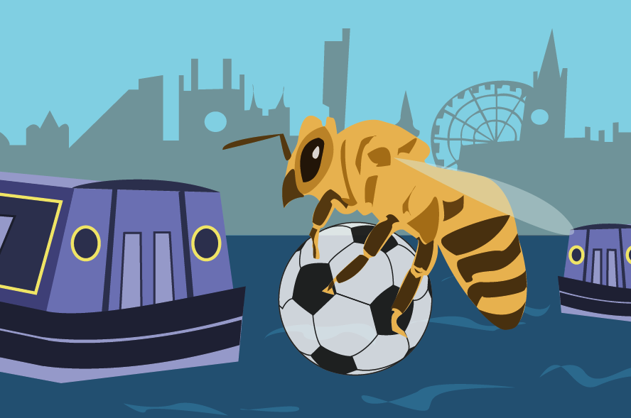
What is the most important element in the image? It should be the biggest. Here the boat is the biggest. Do I look at boats and instantly think of Manchester? No. Therefore the bee should be the biggest.
Here the boat looks a little lonely, it may be better to enlarge it, and balance it out with another boat.
Is the bee too high? Too much space at the bottom of the image?
Better, but the elements don't overlap, if they did, even slightly it would give a better sense of a third dimension.
I decided to make this version my final image. At this stage I was rapidly losing patience with the Manchester composition, and also rapidly losing time to complete the other two postcards.
Composition
Thirds
Composition
Thirds
The image abides relatively well to the rule of thirds, with the bee and football situated near enough spot on in the four centre focal points. The horizon line is almost spot on too, creating a greater sense of balance.
The line of sight isn't so interesting. Considering my attempt at overlapping elements of the image, it still seems very flat, merely leading right across from the boat, back to the bee along the skyline and upwards.
The line of sight isn't so interesting. Considering my attempt at overlapping elements of the image, it still seems very flat, merely leading right across from the boat, back to the bee along the skyline and upwards.
Problem Analysis
Going back to not investing enough time into my roughs, this has caused me to design on screen, which isn't good!
I would have saved a lot more time, and been much happier with my design if I would have taken more time into crafting my roughs, and coming up with stronger compositions.
I am going to leave this postcard as it is for now, and maybe make some alterations if I have time once I have finished the other two. I've had such a battle with this Manchester postcard, but in hindsight, at least this version is an improvement from the first.


No comments:
Post a Comment